

Macmillan Children’s books
Following the success of our brand refresh for Pan Macmillan ↗, we were excited to be invited to create a more bespoke brand look and feel for Macmillan Children’s Books (MCB) – closely aligned with the Pan Macmillan brand identity, but distinct and more playful.
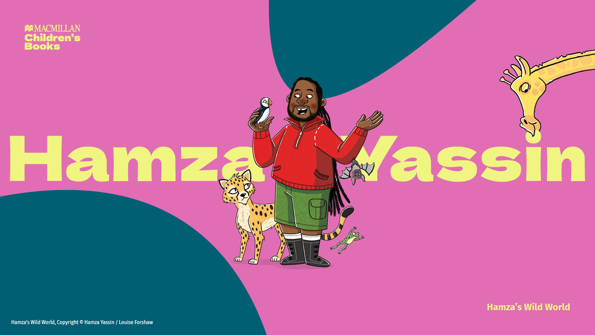
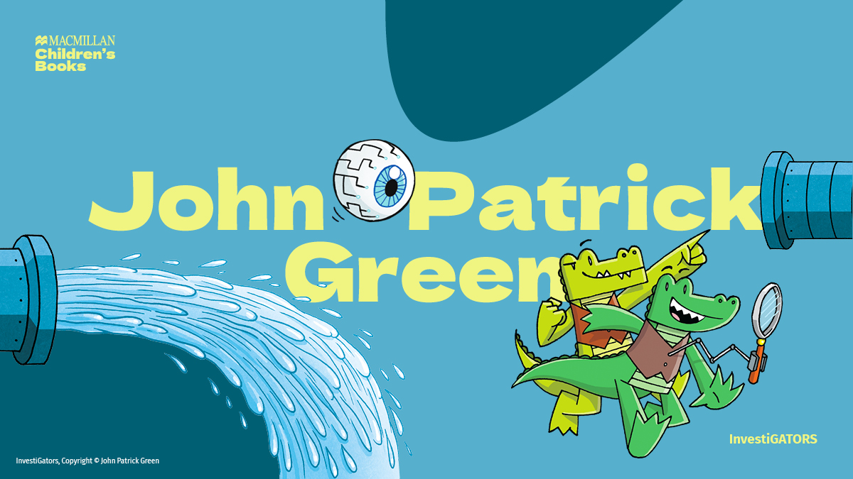
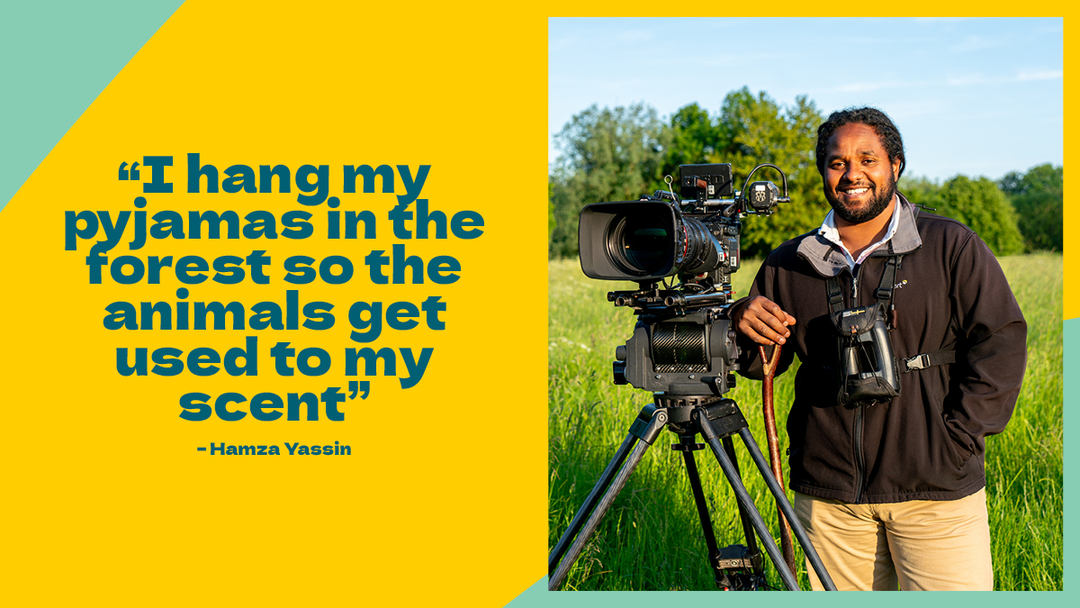
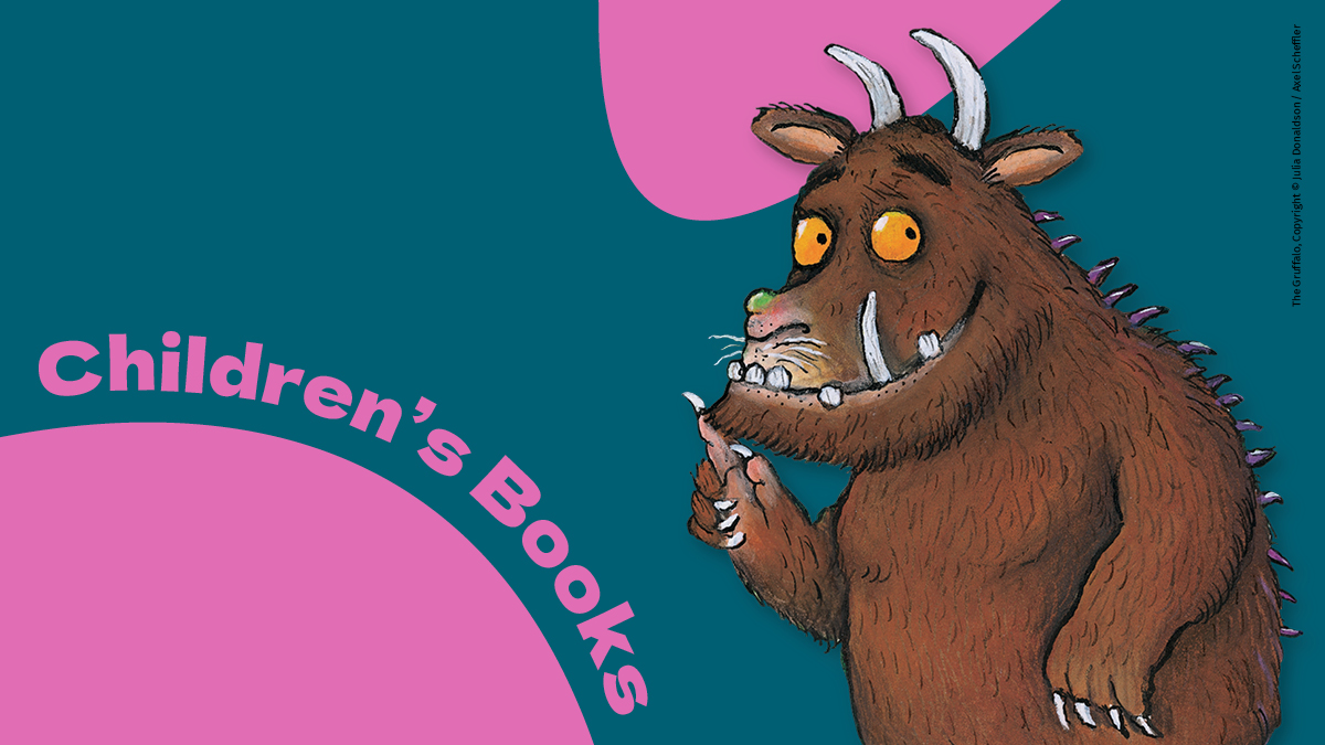
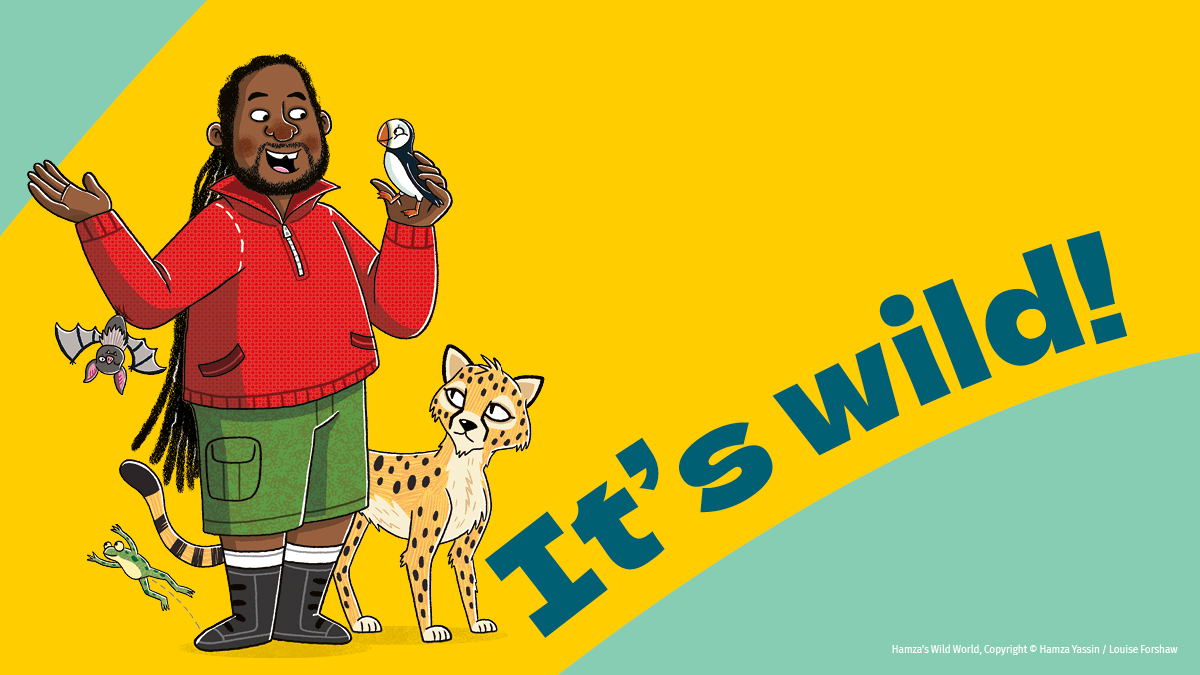
Macmillan Children’s Books has been creating and publishing exciting stories for children of all ages for over 150 years and was the original publisher of classic heritage titles such as The Adventures of Alice in Wonderland and The Jungle Book. Their authors and illustrators include: Julia Donaldson, Axel Scheffler, Rod Campbell, Frank Cottrell-Boyce, Emily Gravett, Lenny Henry, John Patrick Green, Marcus Rashford, Camilla Reid, Chris Riddell, Emily Varga, Leah Williamson and Hamza Yassin.
Along with creating a new look and feel, the scope included a refinement of the existing Macmillan Children’s Books logo, which was admittedly impractical in shape, included the colour red and had a more traditional font used for the Children’s Books element.
The division includes Young Adult crossover, so the new logo and brand needed to feel appropriate to represent children of these ages and the real breadth of the brand’s audiences, from authors and illustrators, agents and booksellers, to gatekeepers and employees – joyful, but not too childish.
COLOUR
The existing colour palette, which we refined and optimised as part of the Pan Macmillan brand identity, was already bright and joyful with shades that would complement and could also be used in refreshing combinations to add vibrancy. We simply removed the use of the more ‘grown up’ Dark Blue, to ensure combinations used would always feel bright and playful.
TYPE
We explored a more informal secondary font, and chose Dela Gothic One – a bold, playful and characterful typeface that would bring joy and modernise the brand logo – and could also be used to create bold, large, eye-catching headlines that can interact with a world of illustration and work equally well as larger text. The typeface is chunky and wide, with curvy quirks throughout that add the playful, unique and intriguing elements we were looking for, while not being too childish. It can also be used to follow the angle of the brand ‘crops’, by curving round them to bring further playfulness and emphasis.
The Mid Blue is the default for type, with other combinations used to bring continued interest and variety. The new typeface brings impact and character to the brand and is designed to be used large wherever possible.
PLAY
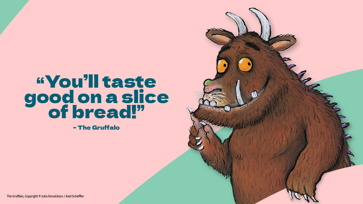
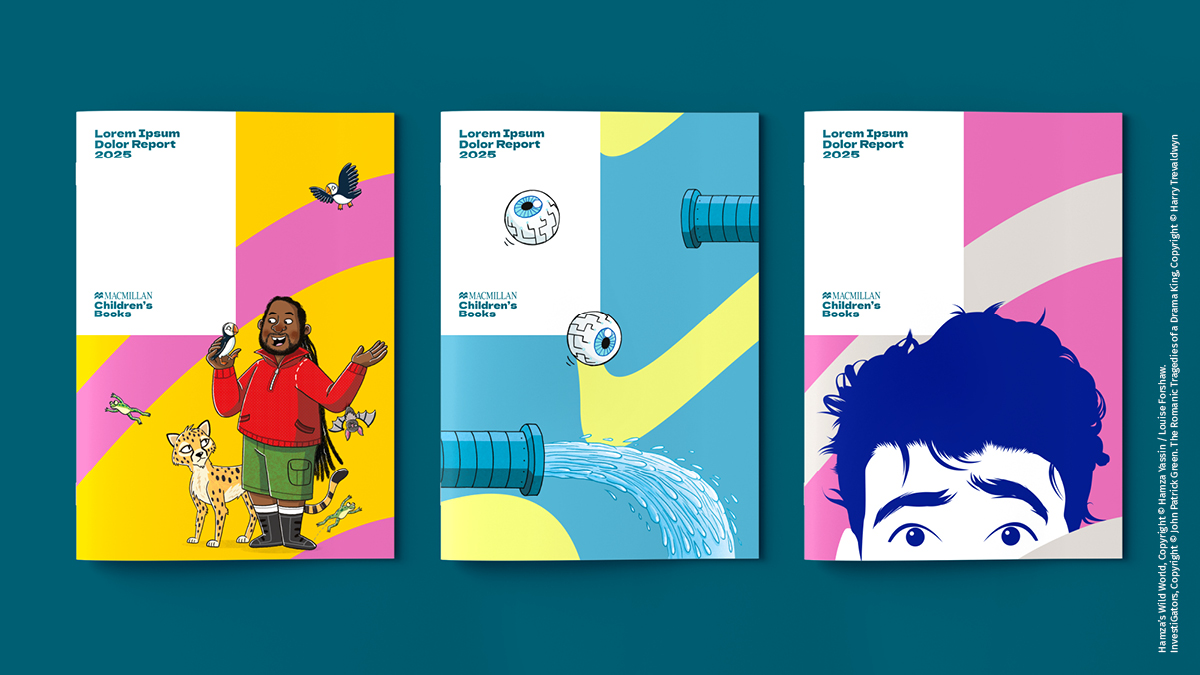
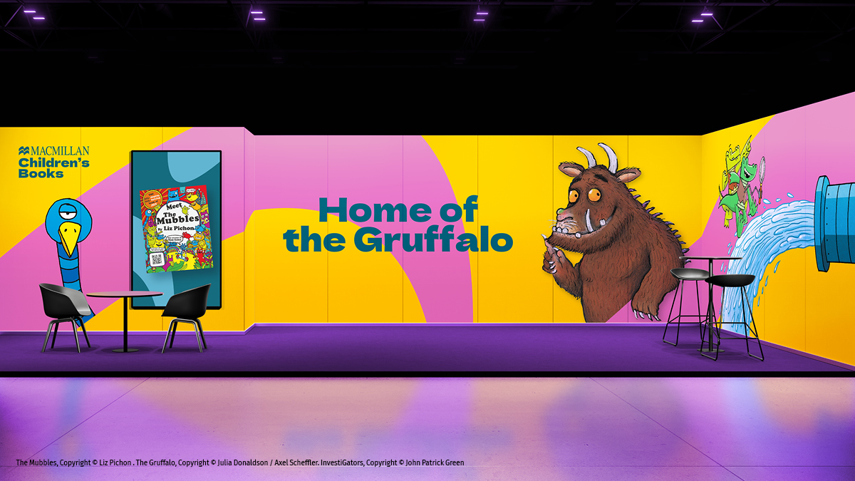
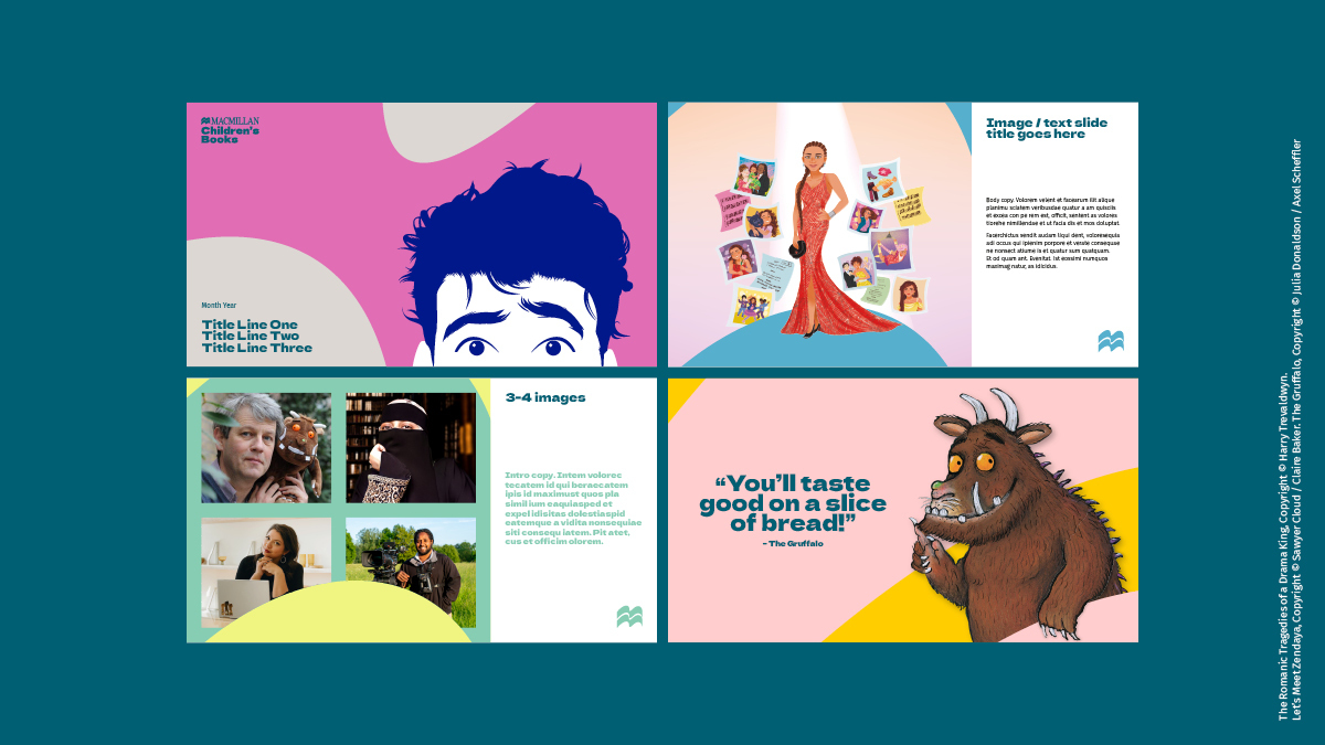
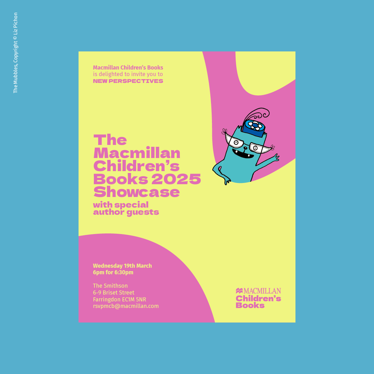
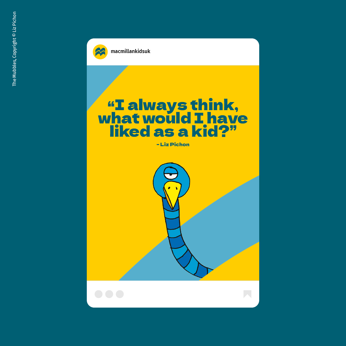
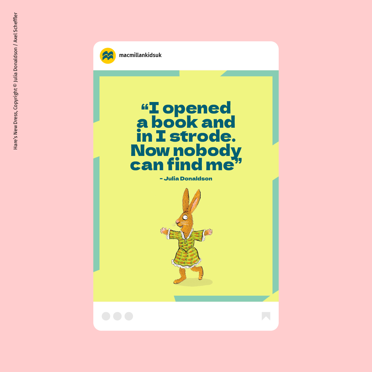
We dialled up the element of interaction between the character illustration and book cover artwork with both the typeface and the Pan Macmillan ‘crops’ to create an immersive, creative and playful feel. This works across the breadth of books published, from baby board books, picture books, middle grade and YA crossover, to bring the stories closer to the audiences. From a giraffe nibbling a letter on a title, to snowflakes filling a report cover, and the Gruffalo’s arm sitting over a ‘crop’ – we can hero new content as well as the classics and well-known stories – and create a sense of depth and interest in all communications. A short, large headline message engages the audience and can anchor a hero illustration.
As with the Pan Macmillan brand, photography can also interact with the colourful ‘crops’ and we created a new framing system for the MCB brand, which works well on social posts.
LOGO
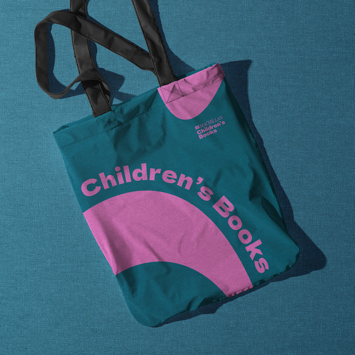
We removed the colour red from the logo, consistent with the Pan Macmillan brand and designed a new lockup featuring the Children’s Books element in the new typeface, left aligned. The new logo is bold, clear, more practical, and showcases the joy at the heart of the brand. It can be used in a variety of colours from the palette, bringing the brand to life flexibly.
SUMMED UP
The new playful brand reflects Macmillan Children’s Books’ commitment to creating and publishing entertaining and inclusive books for children and young people of all ages. It truly celebrates their authors and illustrators and strengthens the profile of the brand in the industry.
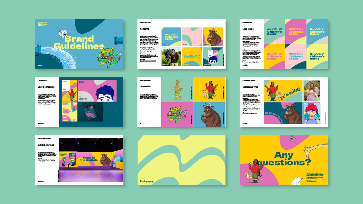
As a flexible system, with a comprehensive set of brand guidelines and templates, the brand can be easily interpreted by teams across the business, establishing tools and assets that employees can be proud of.
The new look and feel has been applied creatively to a variety of applications for a cohesive and inclusive feel across presentations and pitches, social media, press releases, invites, reports and exhibition stands.
An identity of its own, with consistency across the Pan Macmillan brand.
In the press
The Bookseller ↗