


Pan Macmillan
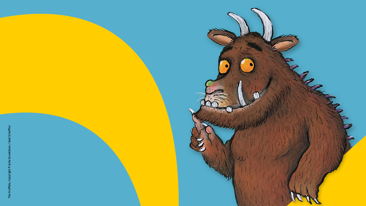
A brand refresh for Pan Macmillan, one of the big four, an international consumer book publisher, famous for publishing titles such as The Gruffalo by Julia Donaldson and Axel Scheffler, The Hitchhiker’s Guide to the Galaxy by Douglas Adams and Alice in Wonderland by Lewis Carroll.
Pan Macmillan wanted a new look and feel for their brand that would strengthen awareness and support their existing brand identity, using their globally recognisable logo in a new way to bring the brand to life.
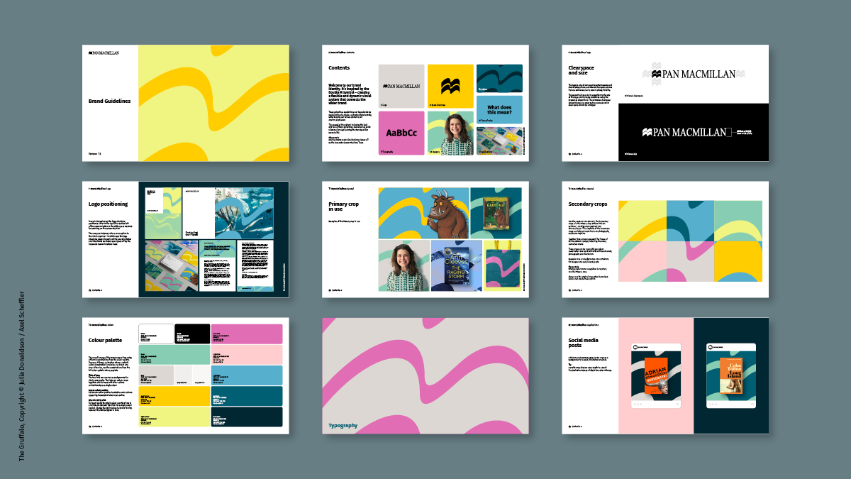
The project required a new concept, assets, communications, and a comprehensive set of brand guidelines that could be creatively and confidently used across the business to showcase the brand consistently and represent the values of Pan Macmillan.
Our idea was built around freeing the brand, to truly represent the breadth and diversity of Pan Macmillan’s publishing programme across ‘The House of Pan Macmillan’ and all the teams within it – everything connected.
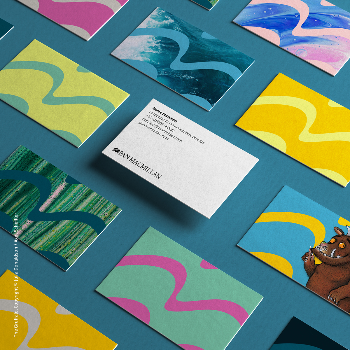
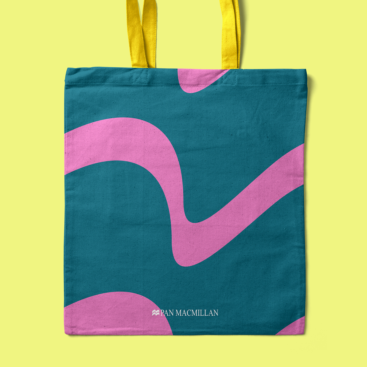
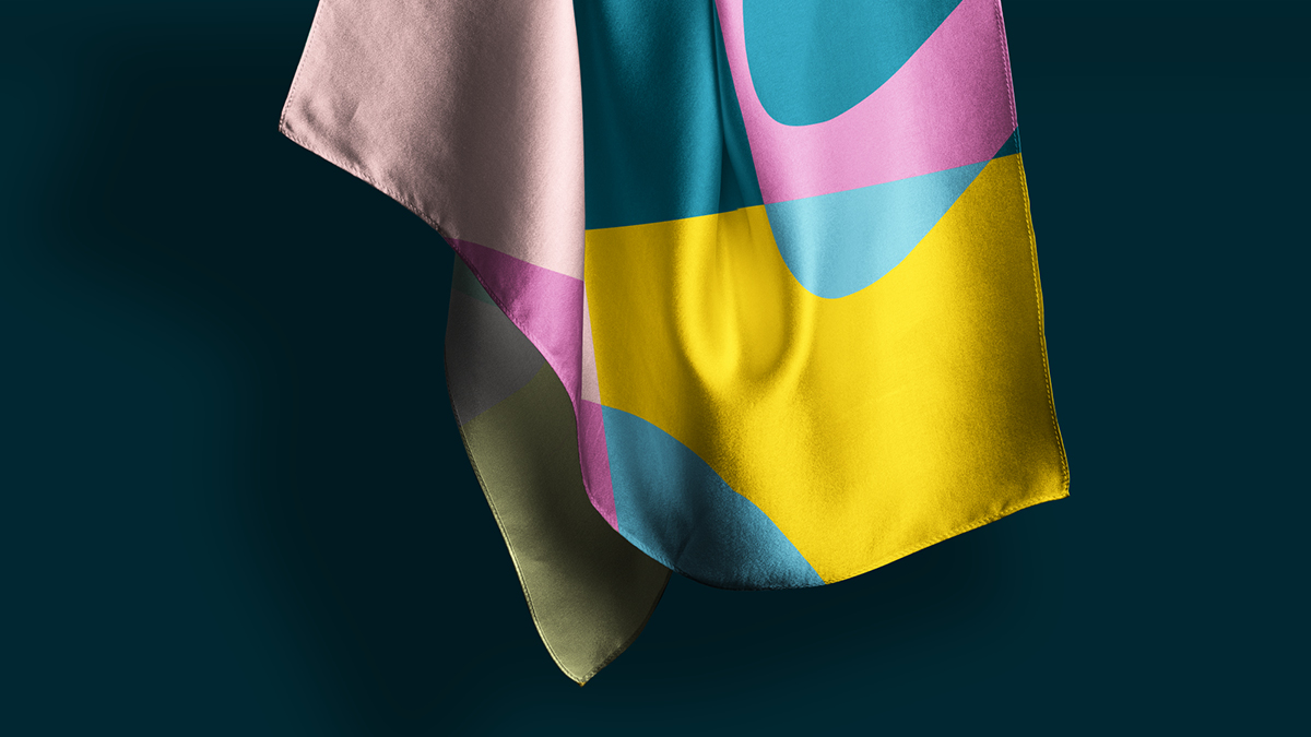
Turning the logo into a graphic device we created a distinct, diverse, colourful, immersive, flexible, and adaptable identity – that’s recognisable and memorable, reinforcing brand awareness.
We optimised the existing colour palette, ensuring it felt ready to take the brand forward, with shades that would complement and could also be used in refreshing combinations to add vibrancy. Ultimately, a palette that could be used in many ways to add longevity to the look and feel and interest to all future communications.
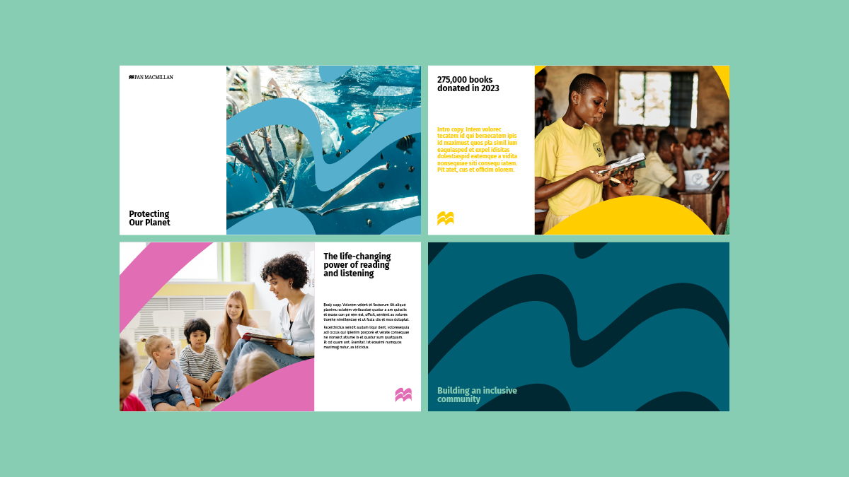
To bring people even closer to the brand, we created a large crop of the logo which can be used with combinations of the brand colours, photography or imagery, and divided this crop into six further elements – all still connecting the ‘Double M’s’ of the brand logo, while creating a tapestry of shapes and colours that can be used creatively across the brand toolkit.
The brand can be combined with photography, art, or illustration by placing imagery inside of the crops to create a visually interesting and immersive feel while prominently featuring the brand. Imagery can also be blended with the crops to create texture by making the crops translucent to highlight parts of the featured image.
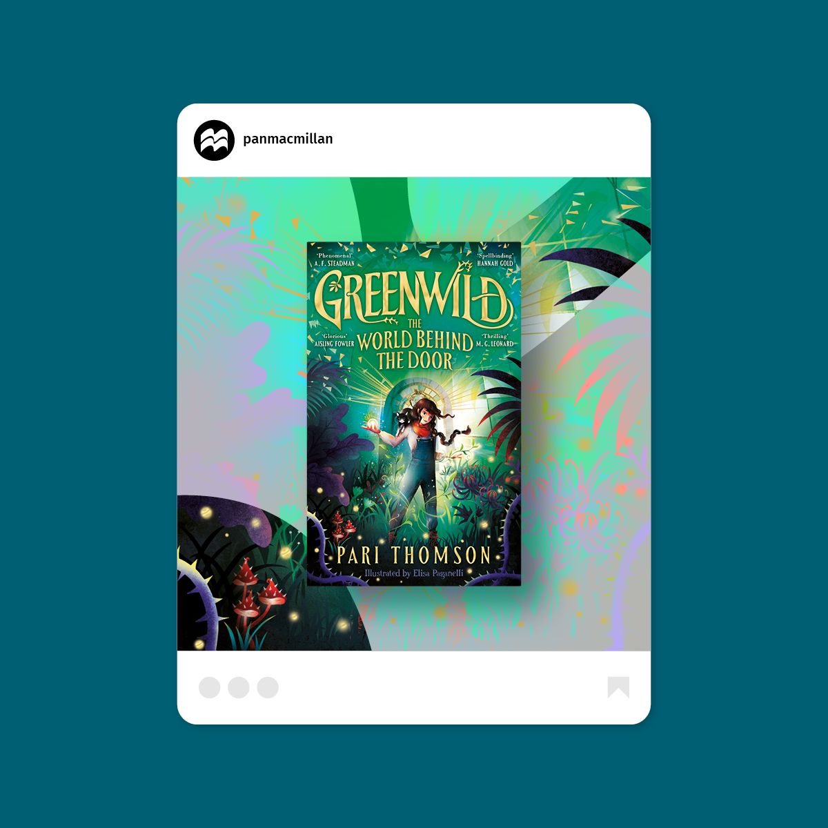
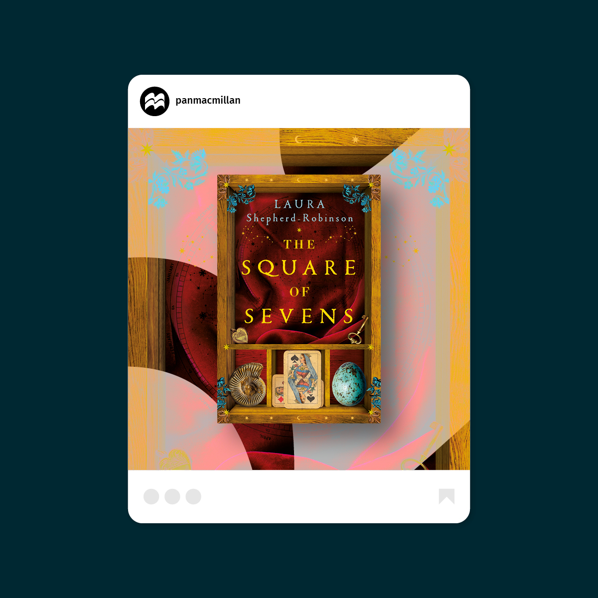
The colourful crops also act as a platform for featuring cut-out imagery such as portraits, characters from stories and to promote book covers, with a wide variety of backdrop options to bring flexibility and freshness on social while maintaining consistency.
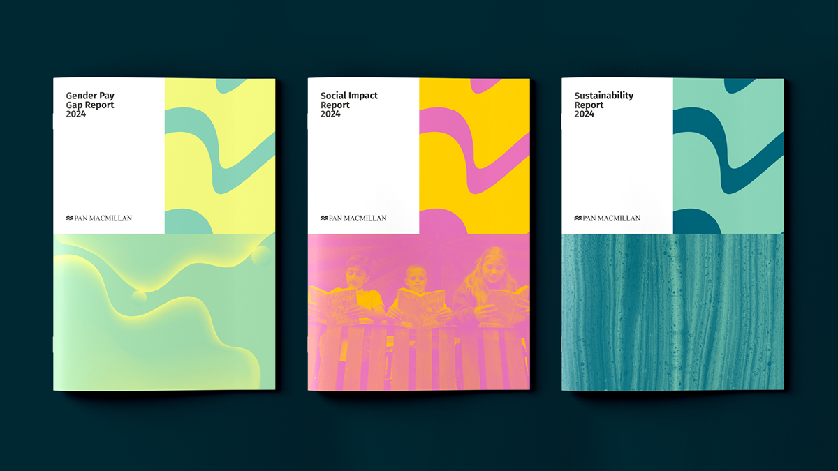
Report covers feature abstract imagery to give an interesting, creative feel that’s also practical and removes the need for generic stock imagery.
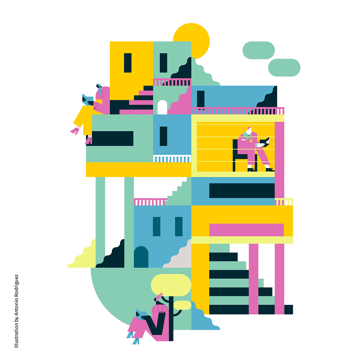
We recommended an illustration style and illustrator to compliment the new look and feel. This storytelling style has a unique approach with content that is conceptual and current and relevant to Pan Macmillan’s business and its audiences. It’s bold, confident and works perfectly with the colour palette.
We created a motion toolkit to further bring the brand to life. This includes a logo animation designed to reflect the history of the Pan Macmillan logo – representing a book – with the pages turning, showcasing the bold colours of the refreshed identity. Wipes, transitions, lower thirds, and chapters were created, all with page turning animation and text typed out.
The new and original brand elements work seamlessly together, resulting in a contemporary brand identity with links to its literary heritage as well as its present and future.
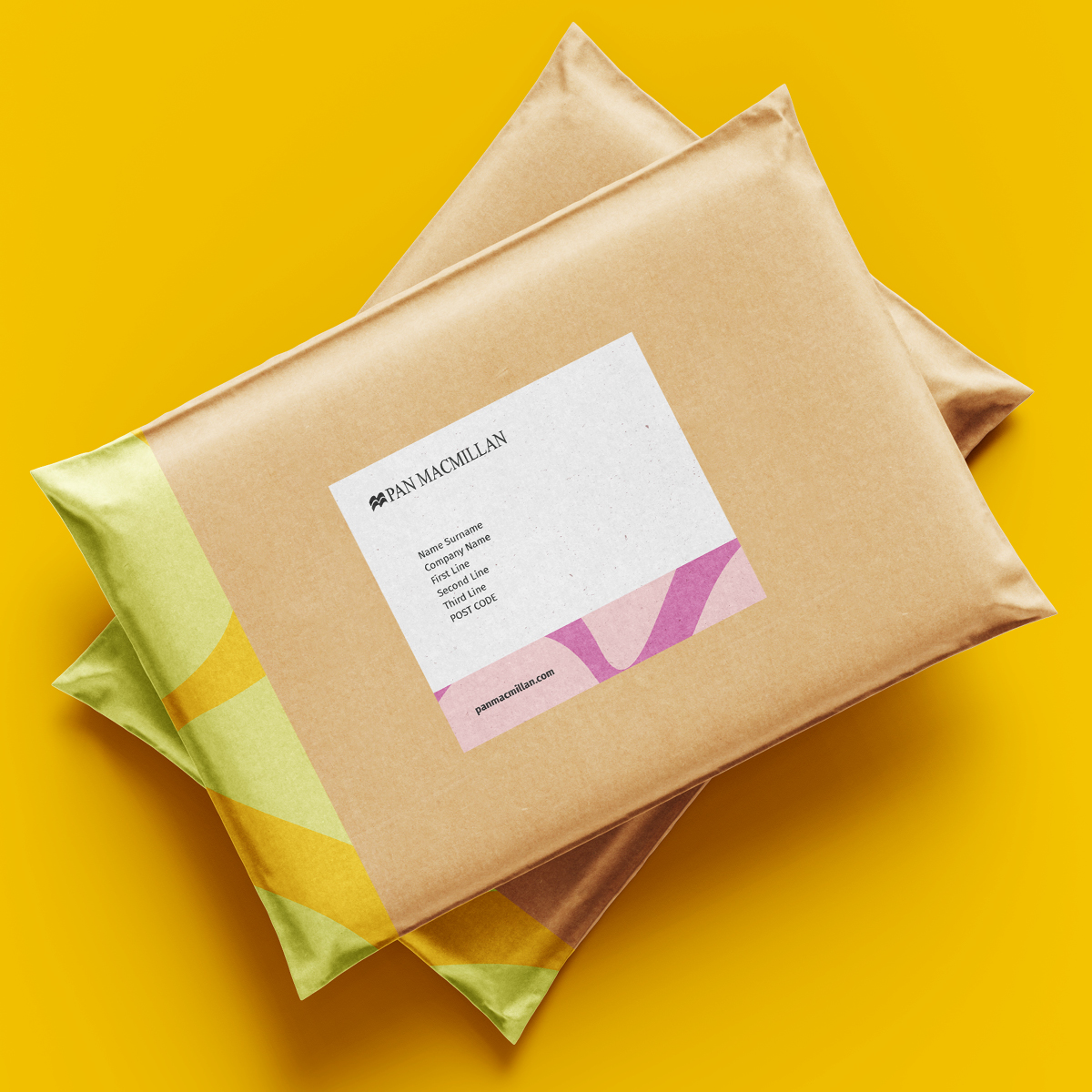
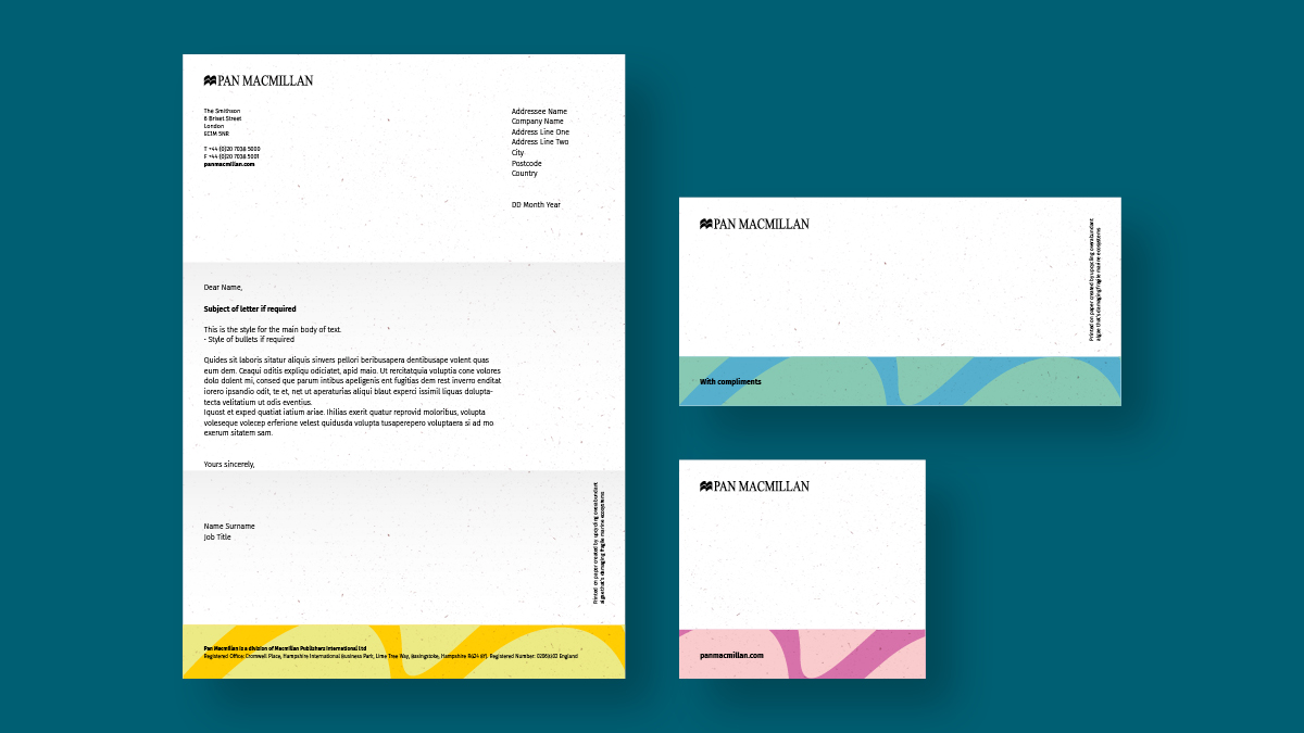
The new look and feel is applied creatively to a variety of applications for a cohesive and inclusive feel across presentations and pitches, social media, press releases, catalogues, reports and stationery – sustainably printed on paper created by upcycling overabundant algae that’s damaging fragile marine environments. The comprehensive set of guidelines created ensure that the brand can be easily interpreted by teams across the business, establishing tools and assets that employees can be proud of.
In the press
Design Week ↗