


PICCADILLY
A new brand identity for Piccadilly Press (part of Bonnier Books UK ↗) – a children’s fiction imprint, empowering young readers to choose the books they want to read, building a new generation of book lovers.
Piccadilly needed a new brand identity that aligns with their current publishing and reflects who they are today – the home of exciting and engaging fiction for today’s children aged 5 to 12.
Piccadilly is a publishing home for everything from graphic novels to future classics, books that allow readers both escapism and representation. They encourage independence and choice through a wide scope of stories, allowing readers to form their own tastes and reading habits.
They are an energetic imprint that focuses on fun and playfulness and reading for pleasure.
The new identity needed to be playful and energetic, to stand out and be instantly recognisable, raising the brand profile and growing support for the brand across trade, parents, teachers, librarians, booksellers and agents, fostering genuine excitement in Piccadilly’s forward publishing. It needed to work across the key audience too – children as young as 5 and their gatekeepers, and those up to the age of 12.
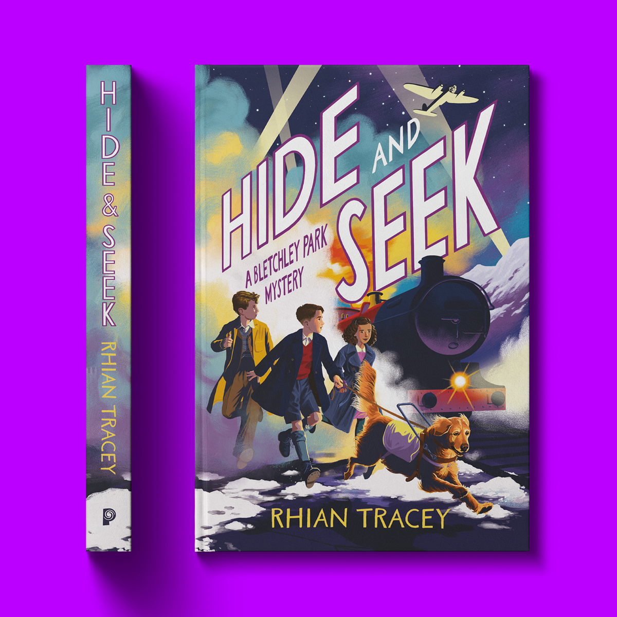
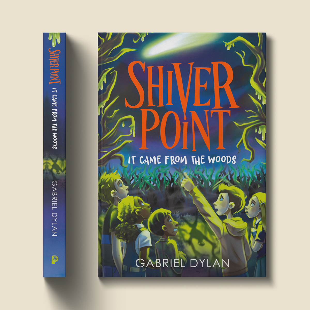
Practically, the new design needed to work in short form on a variety of book spines and have a long form lock-up suitable for other applications.
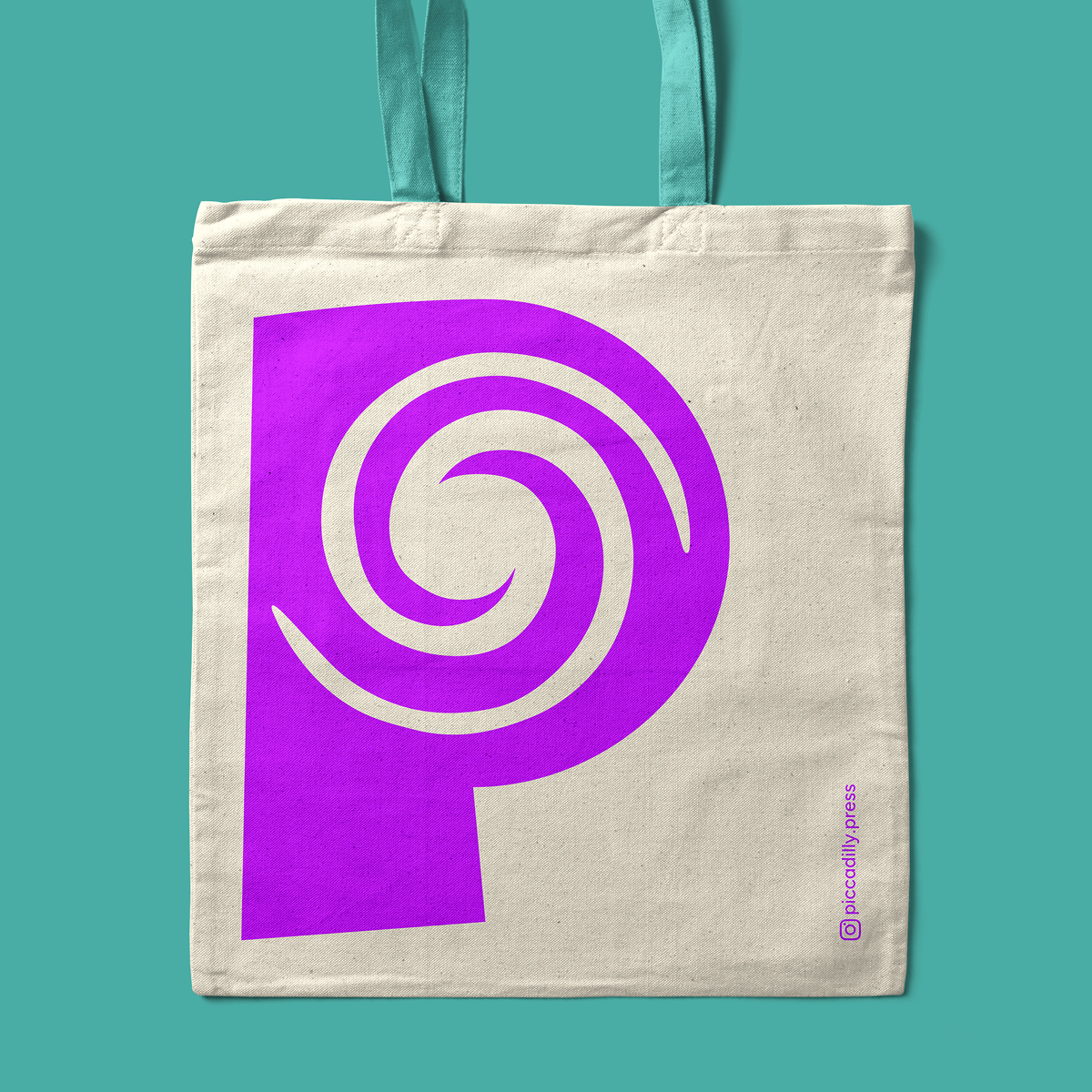
Inspired by the concept of escapism, imagination and the magical adventures awaiting in each and every story, we created The Portal – ‘step into your imagination’. Open a book and be instantly transported to a new world, the past, the future, a limitless adventure, wherever the author and readers imagination takes them. Bringing other worlds and stories closer, allowing young readers to follow their passions and to have fun, as they develop into book lovers of the future.
The design is modern, memorable, playful and fun, without being childlike. The portal sits within a characterful P for Piccadilly which has been shaped to compliment the quirky portal and add interest and joy. The typeface was carefully considered to be bold, yet have a friendly feel and be easy to read.
The imprint will be black or white on books, or draw colour and tone from the book cover content, allowing it to work flexibly. The additional colour palette of purple, turquoise and sand has a magical feel and is also age and gender neutral, so it can work well across the age range and provide further flexibility for social media, events and other communications.
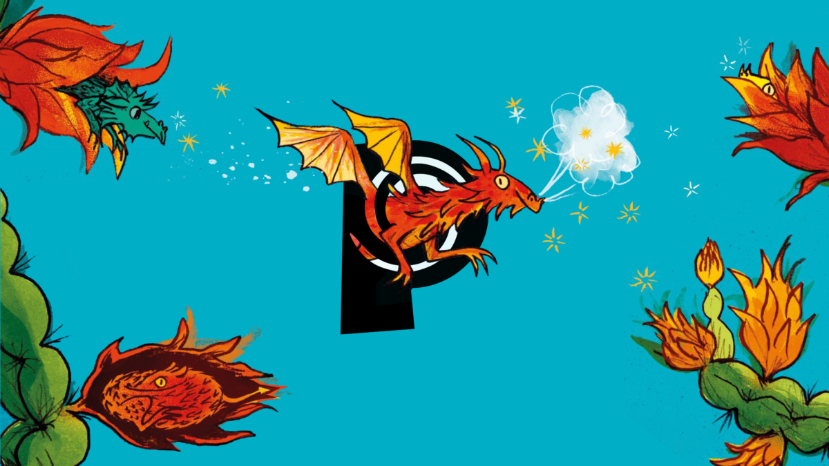
The portal can also be playfully used, both still and animated, to create engaging, swirling social media posts and communications, using book covers and book illustration to bring content to life, with imagery coming out of the portal itself.
In the press
The Bookseller ↗