


WRAP
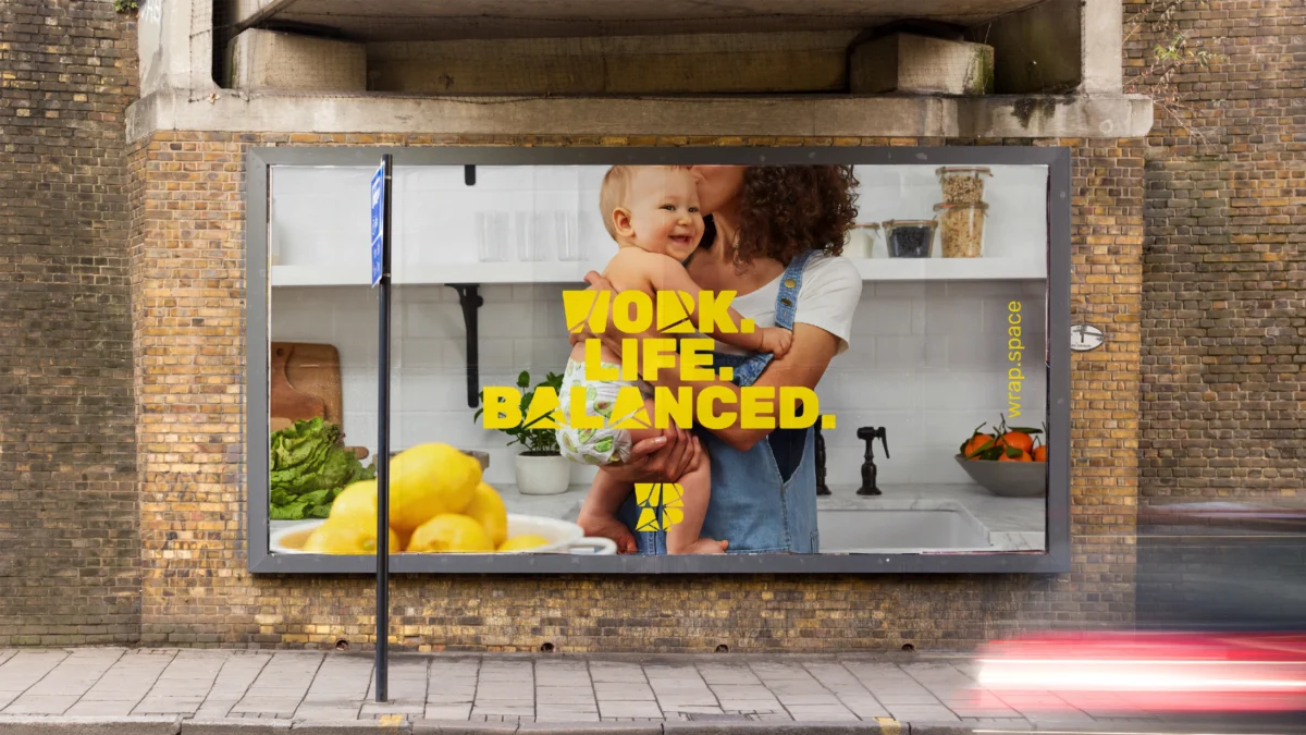
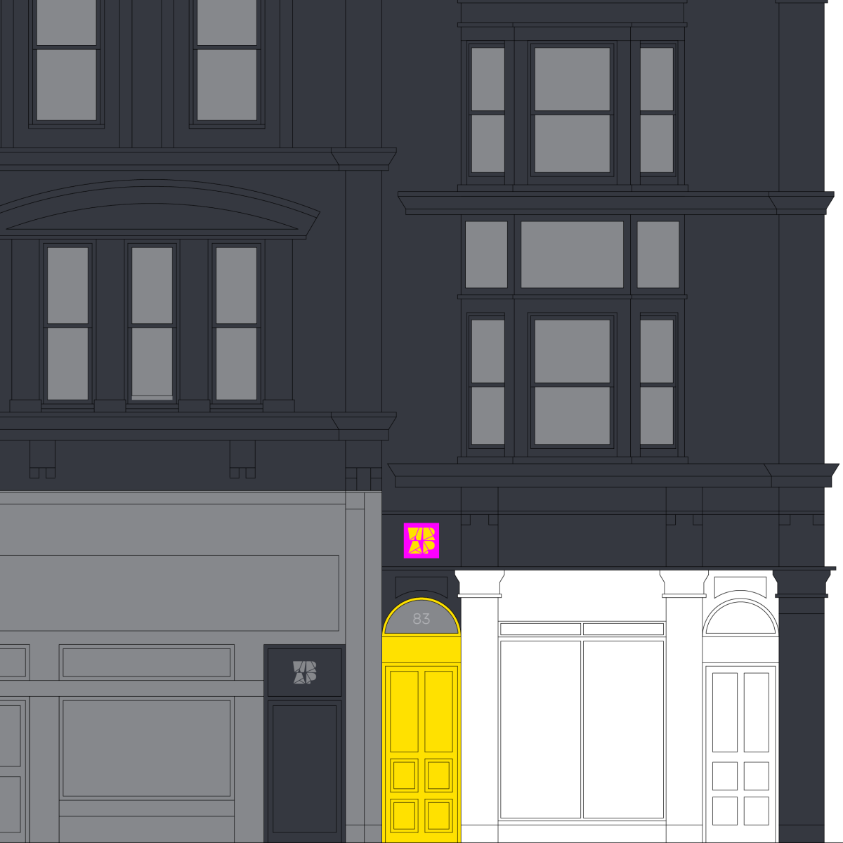
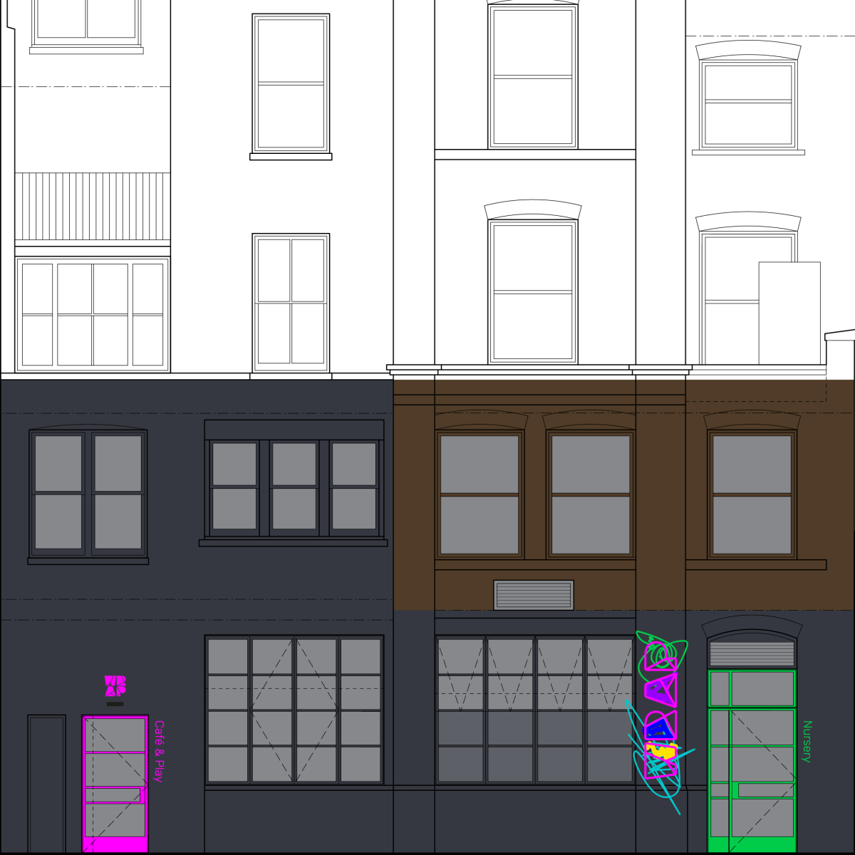
A new brand identity for WRAP, Brighton’s first family friendly coworking space. Featuring shared and private offices, a café, meeting and event spaces and a state-of-the-art nursery and creative play centre. Located within metres of Brighton station, in a fully refurbished pair of six-storey period Georgian townhouses with views across Brighton to the ocean.
WRAP is a team of professional parents who came to Evoke with their start-up concept. Passionate about creating a new kind of business community in Brighton, they wanted to transform the way work and family life exist – bringing the needs of the flexible working parent and young families together, all wrapped up under one roof. WRAP recognised they needed a brand identity and communications that would help make their vision a reality.
To help ensure success, we needed to create a brand identity that communicates this exciting and unique offer to not only the family target audience, but also to other coworkers, and importantly, to investors.
We created and developed a full strategy for WRAP. This solidified not only the creative brief but also the direction we needed to steer through the competition and tell WRAP’s own story.
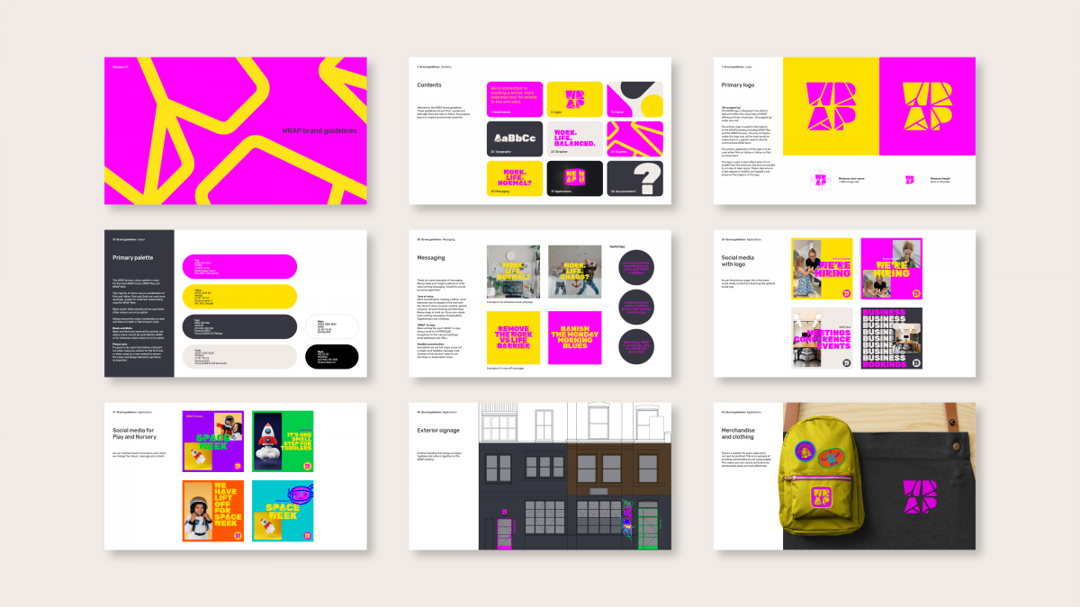
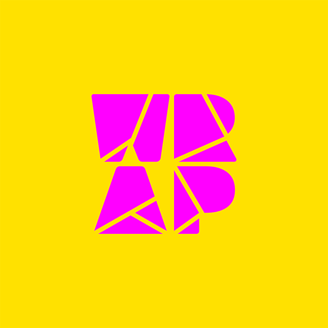
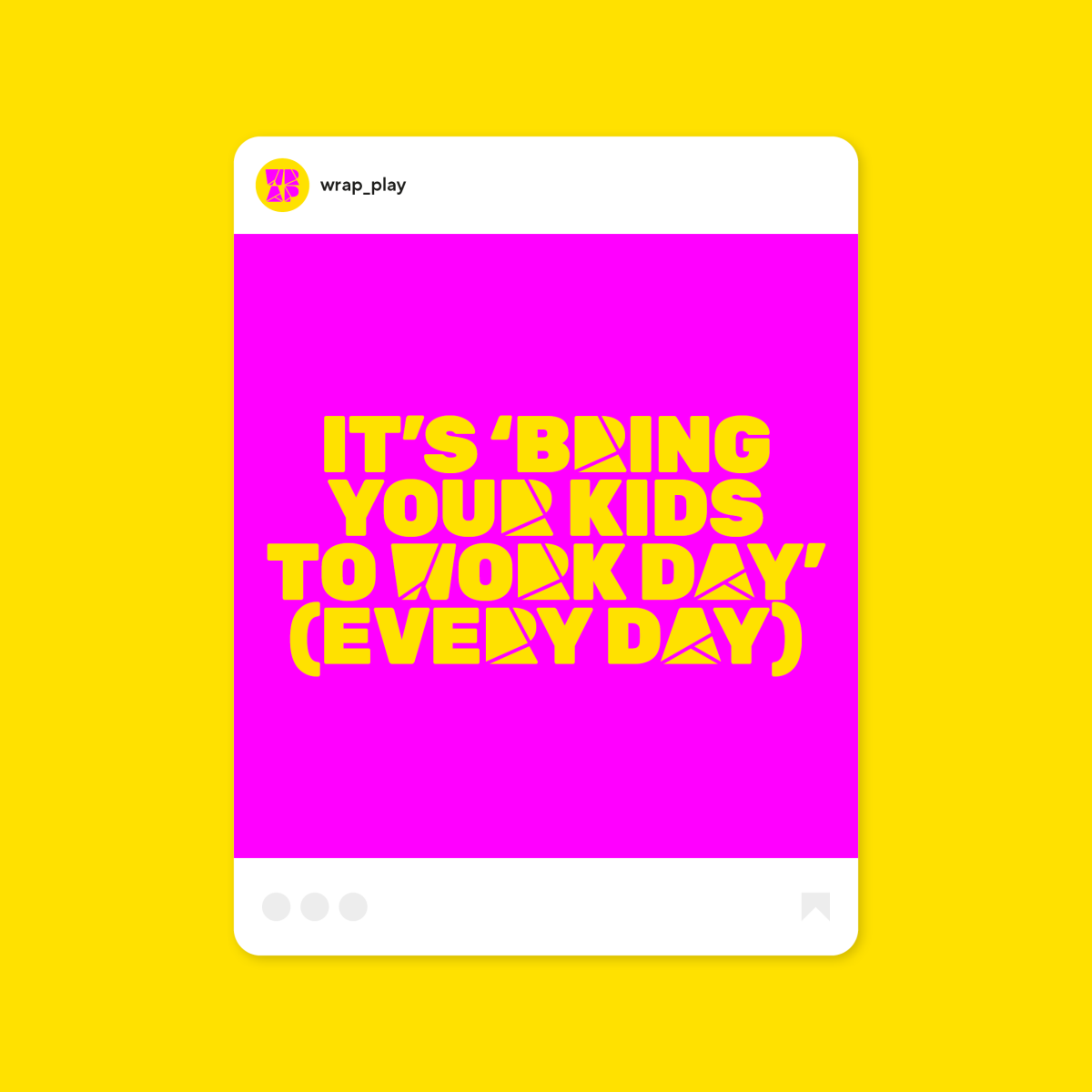
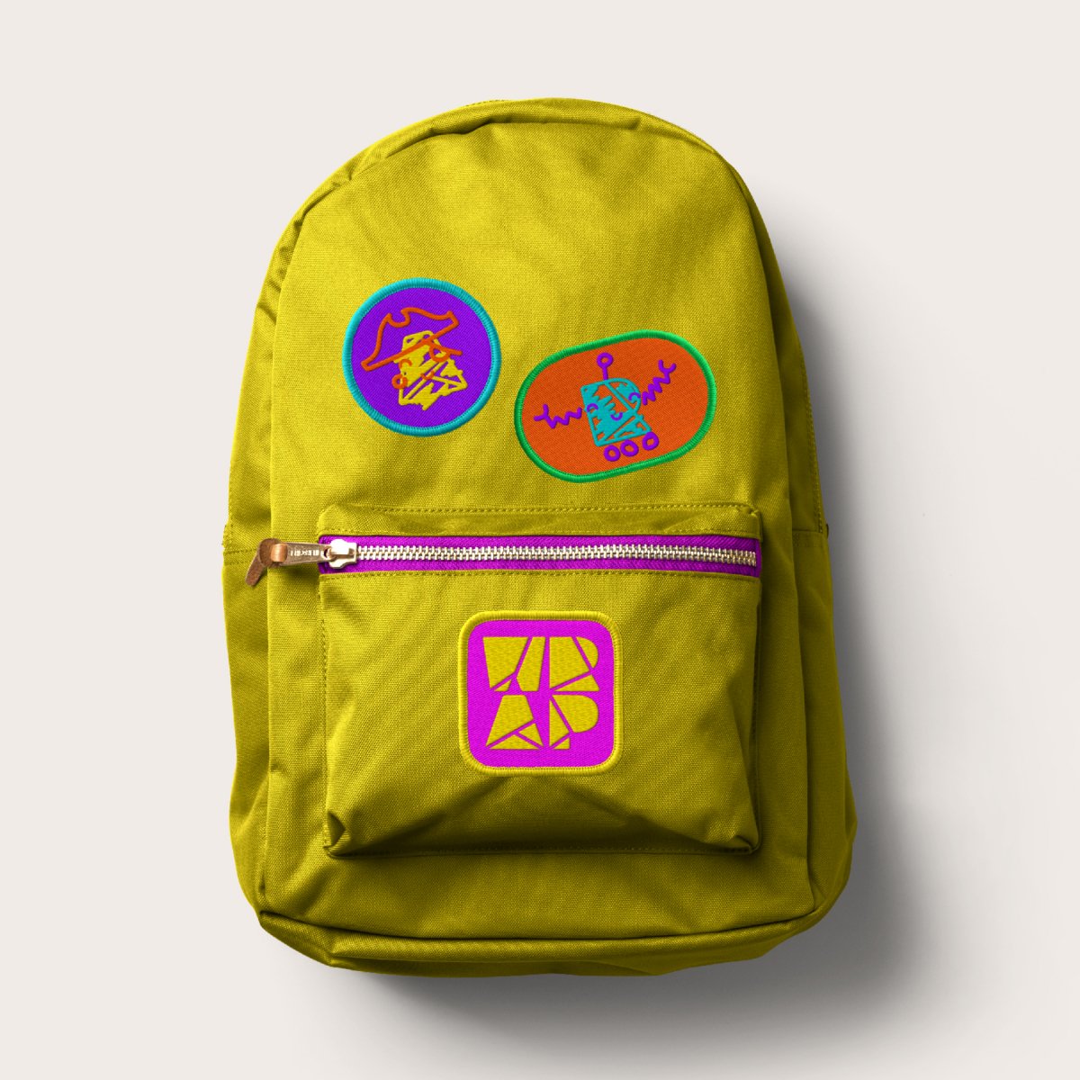
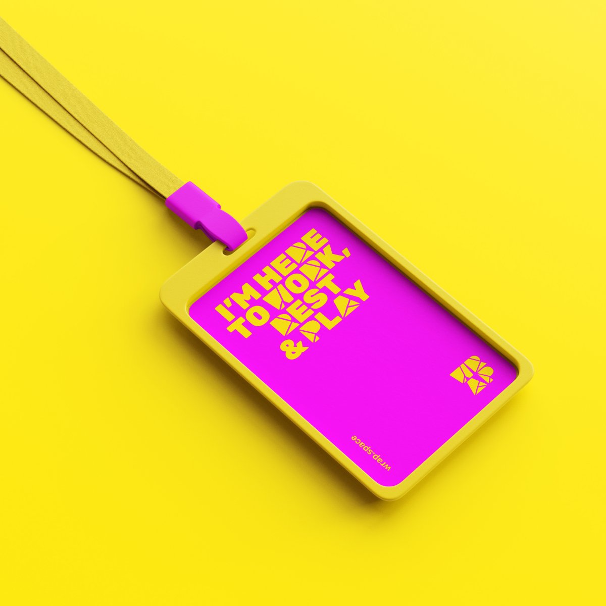
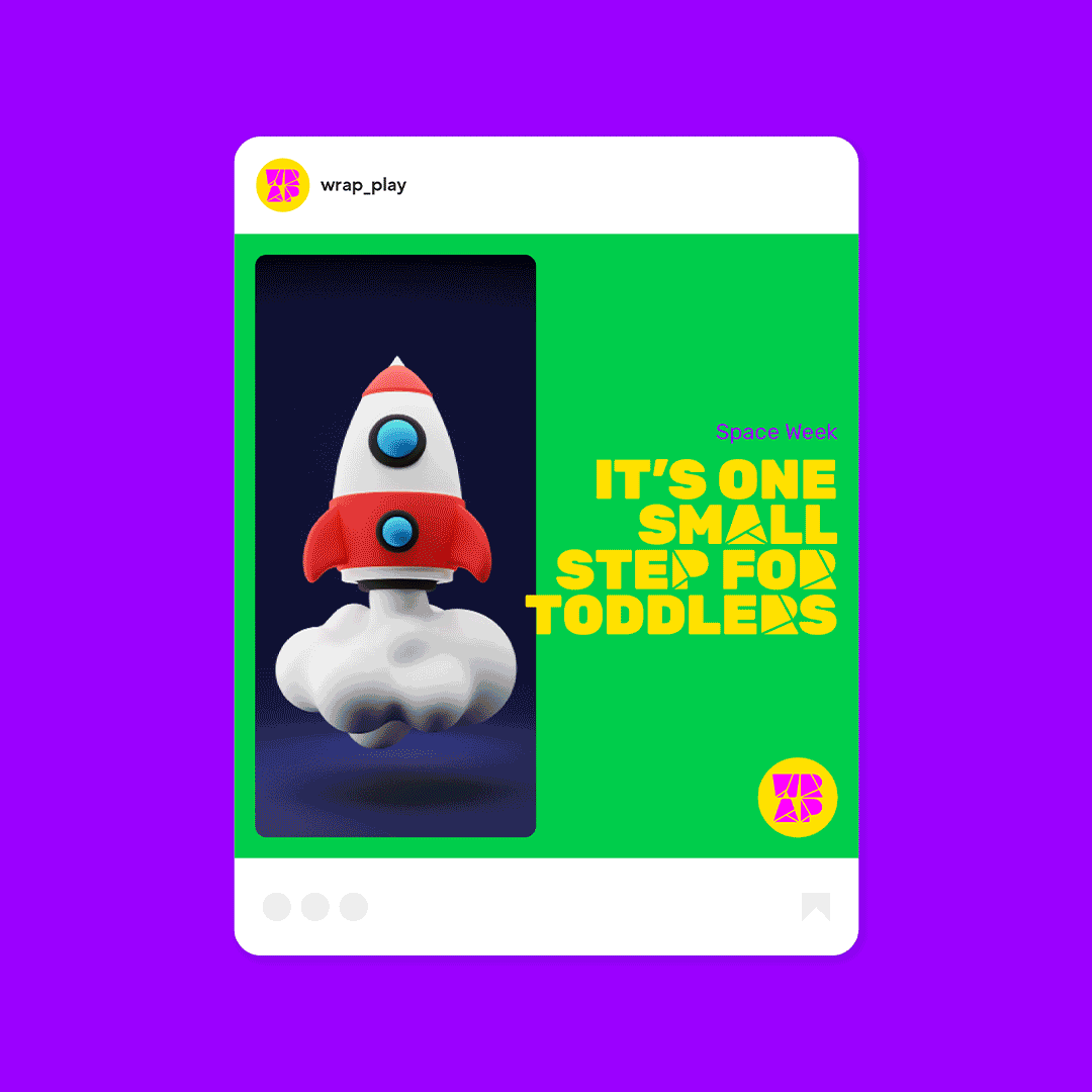
The results are a bold, colourful new brand identity designed to visually reflect the idea of their offer being ‘all wrapped up’ under one roof. The personality drives the short and simple messages with a strapline and hashtag that sums up the brand vision in three words: Work.Life.Balanced.
Each letter from the logo is integrated into a customised typeface for use in headline messaging. The comprehensive brand toolkit also includes animated logos that are used across all moving content. This system allows us to be as creative or practical as needed and lives everywhere – online, offline and is physically embedded across the exterior and interior of the coworking space including signage, messaging and graphics.
The WRAP name is an acronym of ‘Work, Rest And Play’. To communicate effectively to the key audiences of the ‘Work’ and ‘Play’ sides of the space, the brand toolkit can adapt in colour, graphics and tone of voice – ensuring the joyful identity engages both audiences. The nursery is extra playful and features a set of illustrated characters, one for each letter of the logo and uses a fun and energetic secondary colour palette.
To help get the brand from concept to reality, we created advertising, promotional material (both on and offline) plus investor communications in the form of brochures and branding for a crowdfunding video which generated over £300k of investment.
Awards
The Shark Awards – International Design
Brand Identity – Shortlisted