

CIBD
A rebrand for the Institute of Brewing & Distilling, the world’s leading provider of qualifications in the brewing, distilling and related industries.
Originating in 1886, the IBD has now been newly granted Royal Chartered Status, prompting a change of name to the Chartered Institute of Brewers and Distillers (CIBD). The IBD wanted a new look and feel for their brand to signal the change of name and to communicate and celebrate their change of status to a Chartered Institute.
The brief required the brand, specifically the logo, to remain similar to the IBD’s existing one, in overall style, size and form, but to evolve it in a way that celebrated their new status as a Charted Institute. There were also practical considerations to solve, such as making the letters of the logo and typeface clearer and more easily recognisable at first glance, in turn making it easier to implement at different sizes, especially on their website, across social media, videos and merchandise.
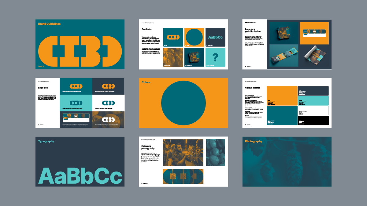
The project required a refreshed concept, toolkit, communications, and a set of brand guidelines that could be creatively, consistently and practically used across the business to showcase the brand.
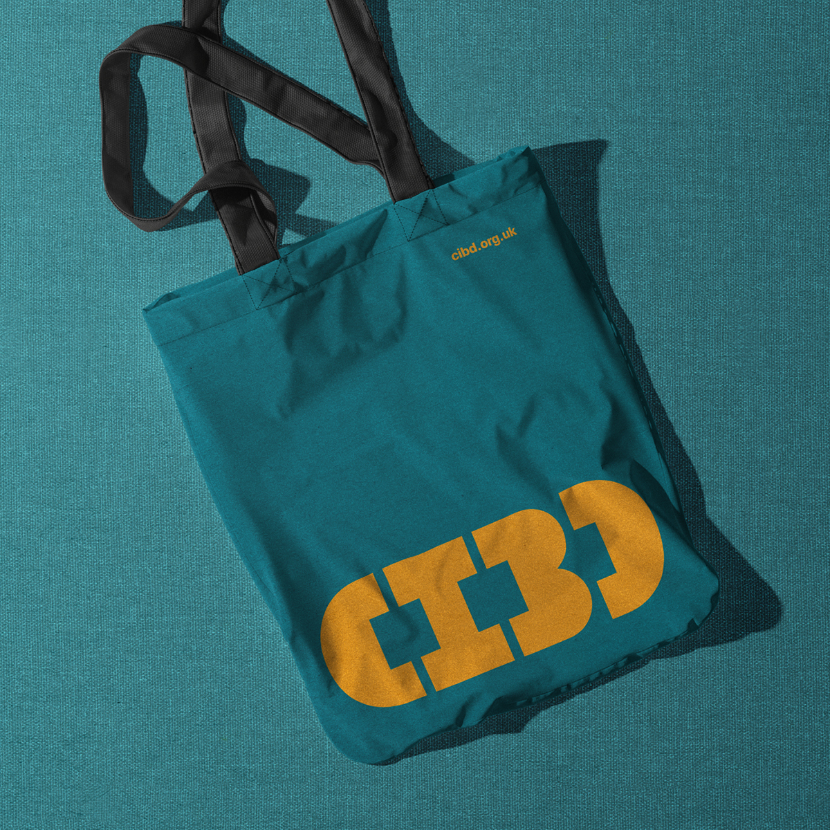
Relishing the challenge, we started by completely redrawing the letterforms from scratch. We made them rounder, narrower, added counters and adjusted the spacing, to not only make them more legible but also to create something more than just a logo – giving us the opportunity to feature the letterforms in different ways throughout communications – adding breadth to the brand and the opportunity to attract and engage with aspiring members in a new way.
The refreshed CIBD brand now features impactful, solid, graphic, geometric letterform shapes that come to life as graphic devices to create a distinct, colourful, flexible, and adaptable identity – that’s recognisable and memorable, reinforcing brand awareness.
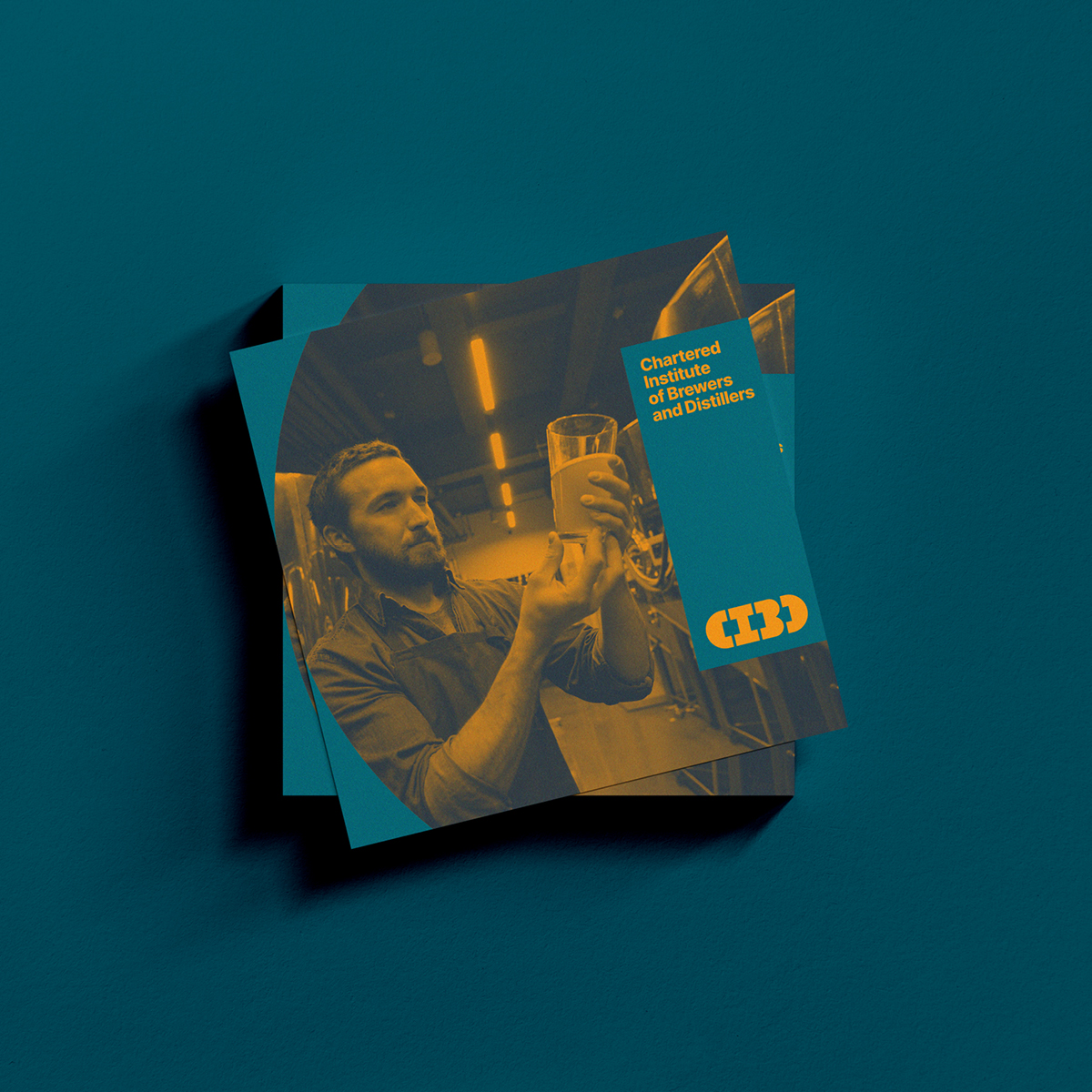
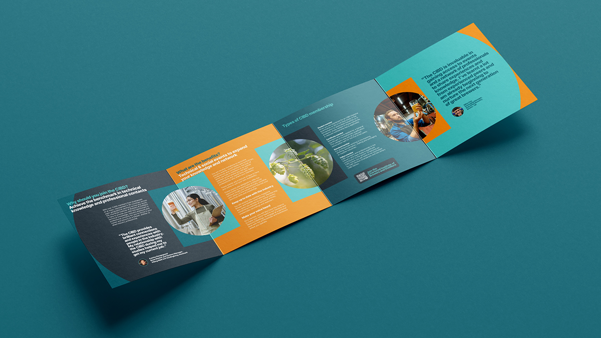
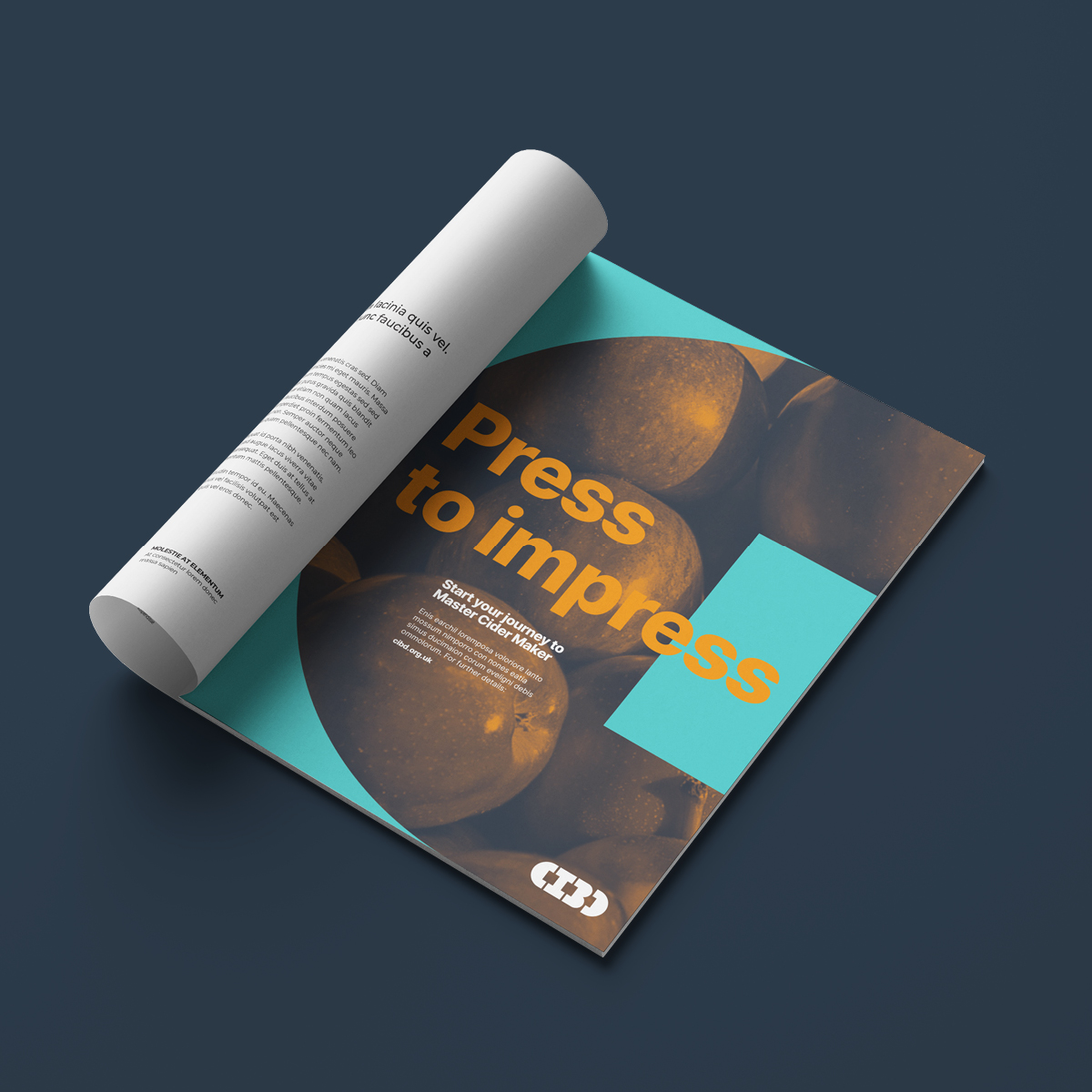
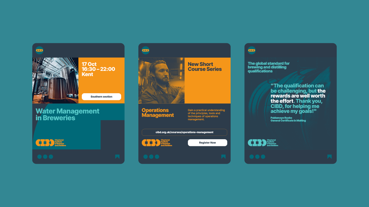
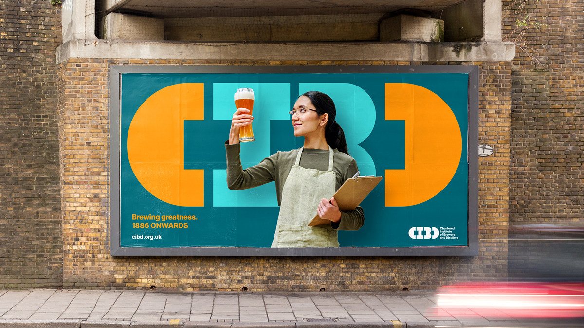
The CIBD brand system combines with photography by placing imagery inside of the logo letterforms to create a visually interesting and immersive feel while prominently featuring the brand. Imagery can also be blended with the brand colours to create feature imagery, such as close up photography of ingredients. The graphic letterforms can act as a background for imagery such as cutout people, ingredients or end products. The C and D can be used to hold imagery, like brackets, adding further flexibility and interest.
We introduced a new typeface combination with feature text that’s big, bold and clear and body text from the same family that’s designed to compliment. We reduced and optimised the existing colour palette to add vibrancy and to enable it to be used in a variety of engaging combinations. We use a warm, glowing shade of orange, reminiscent of something brewed and cooler, water-like tones.
Tone of voice in headline messages can be playful and engaging, drawing from the language of the industry, to attract potential members – for example, ‘Press to Impress’ and ‘Brewing greatness, 1886 onwards’ connect the CIBD’s heritage with their and their members futures.
We had a logo animation in mind from day one, that would reveal itself joyfully by filling up with liquid, representing brewing, distilling and the knowledge gained by the CIBD’s members. The logo animation brings the brand to life in a fresh way, as it aims to attract new members to the Institute.
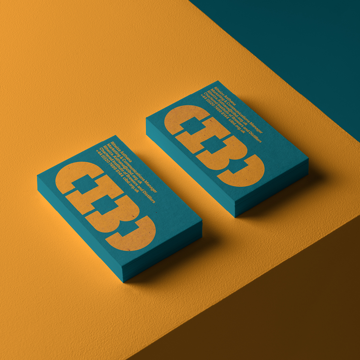
The new look and feel is applied creatively to a variety of applications for a cohesive feel across brochures, magazine ads, membership cards, signage, social avatars, banners and templates, web, merch and stationery – sustainably printed on paper made using spent brewer’s grain. The brand guidelines inspire best practice and ensure that the brand can be easily interpreted by teams across the business, establishing tools and assets that employees can be proud of.
The new brand elements work seamlessly together, resulting in a contemporary brand identity that will engage existing members and attract new ones, while retaining the familiarity of its heritage.
This new expression of the brand pushed the brief further and became a welcomed and exciting progression from the original requirements.
