


Bonnier Books UK
A rebrand for Bonnier Books UK, one of the country’s leading publishers – with headquarters in London’s Bloomsbury Square and owned by Bonnier Books in Sweden, a top-15 world publisher.
BBUK had outgrown its current brand identity and required a refresh to more accurately reflect both the business it is today and its aspirations for the future.
The purpose of the project was to create a more modern, vibrant look and feel that better showcases the breadth and diversity of BBUK’s publishing and their inclusive culture, strengthening brand awareness as a forward-thinking book publishing business for the future – improving brand recognition and consistency of message across all communications.
BBUK’s broad audience consists of literary agents, authors, illustrators, brand partners, staff and industry talent, customers (buyers and retailers), readers and listeners.
BBUK believe in publishing for everyone. They seek to represent, inspire and reach out to all people and publish into every corner of the market, for every kind of reader and listener. They strive to be representative and publish a diverse range of people for a diverse range of readers and listeners. This fosters an inclusive culture that is friendly, down-to-earth and open.
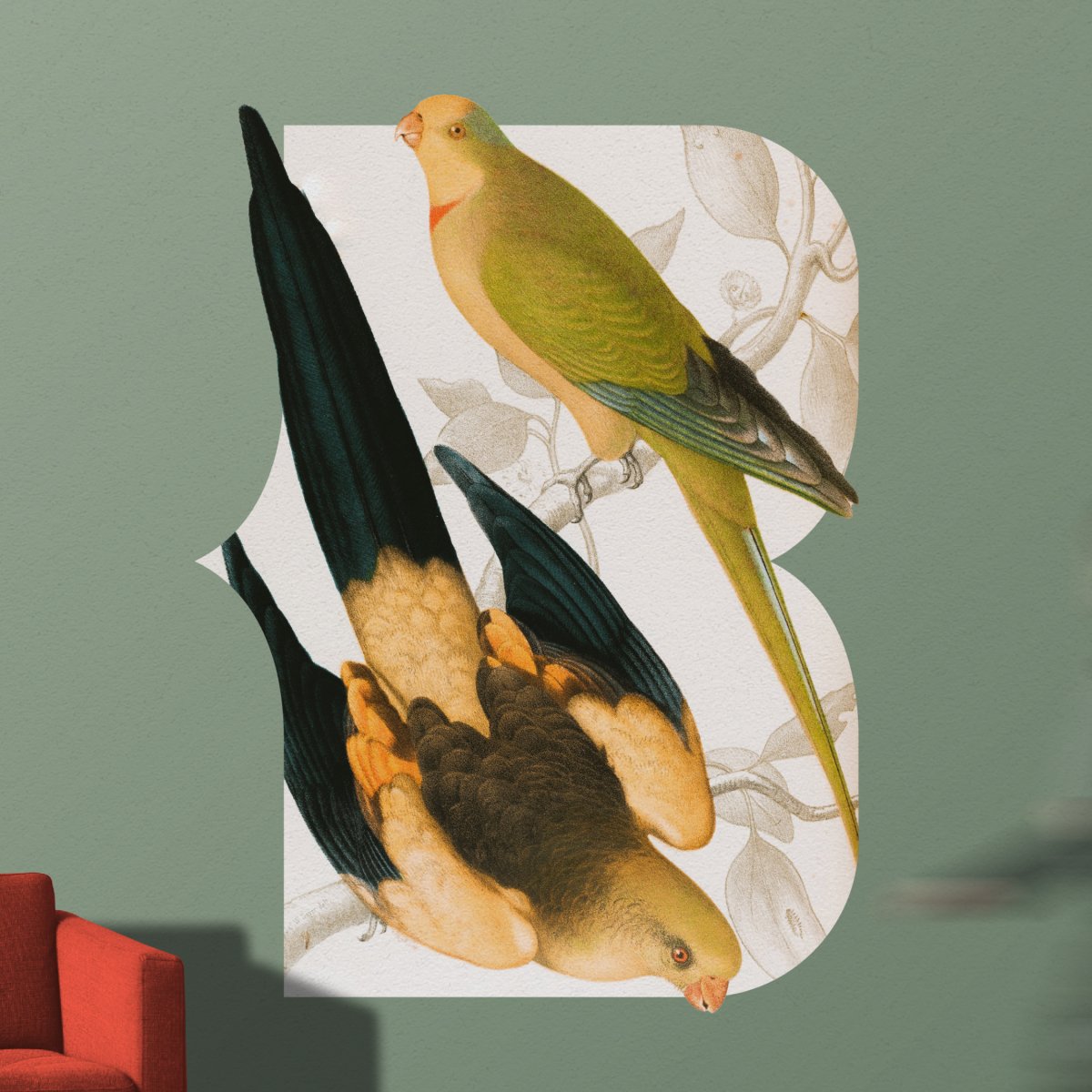
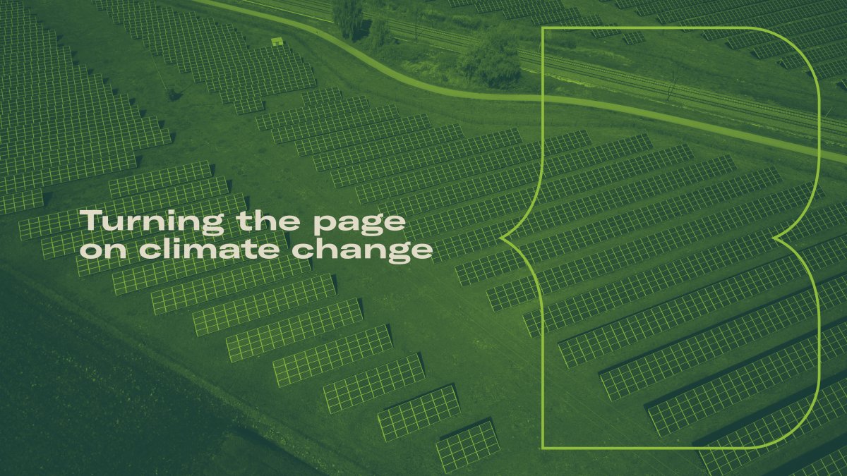
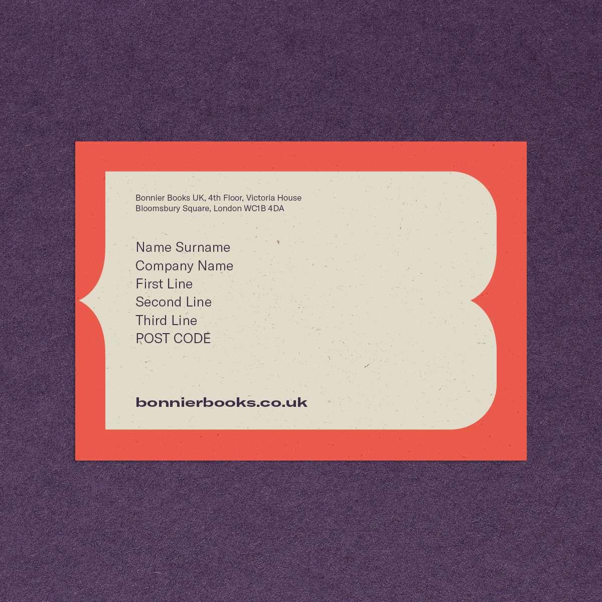
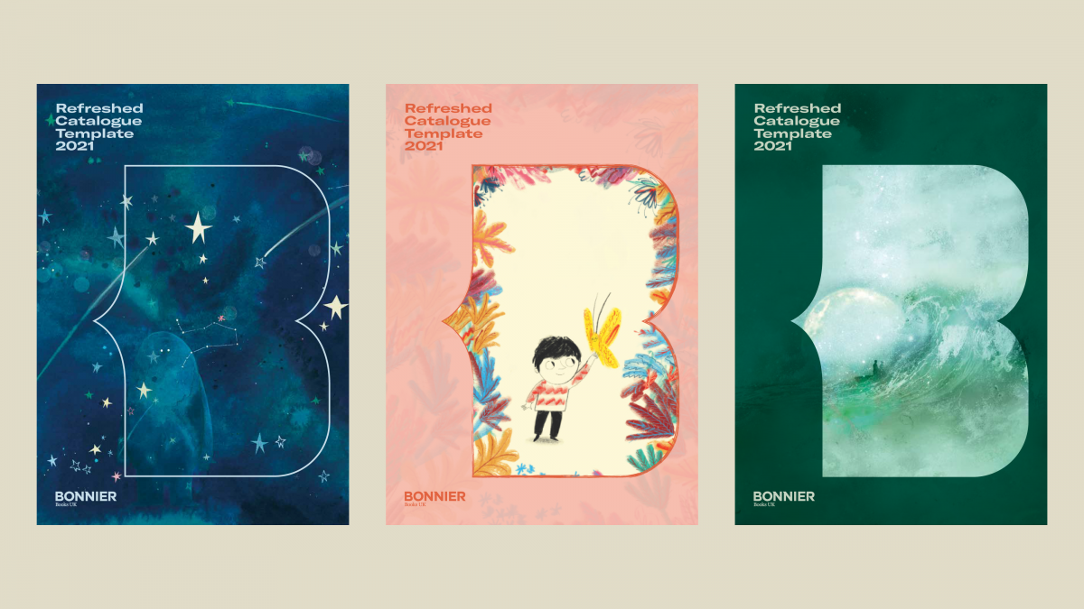
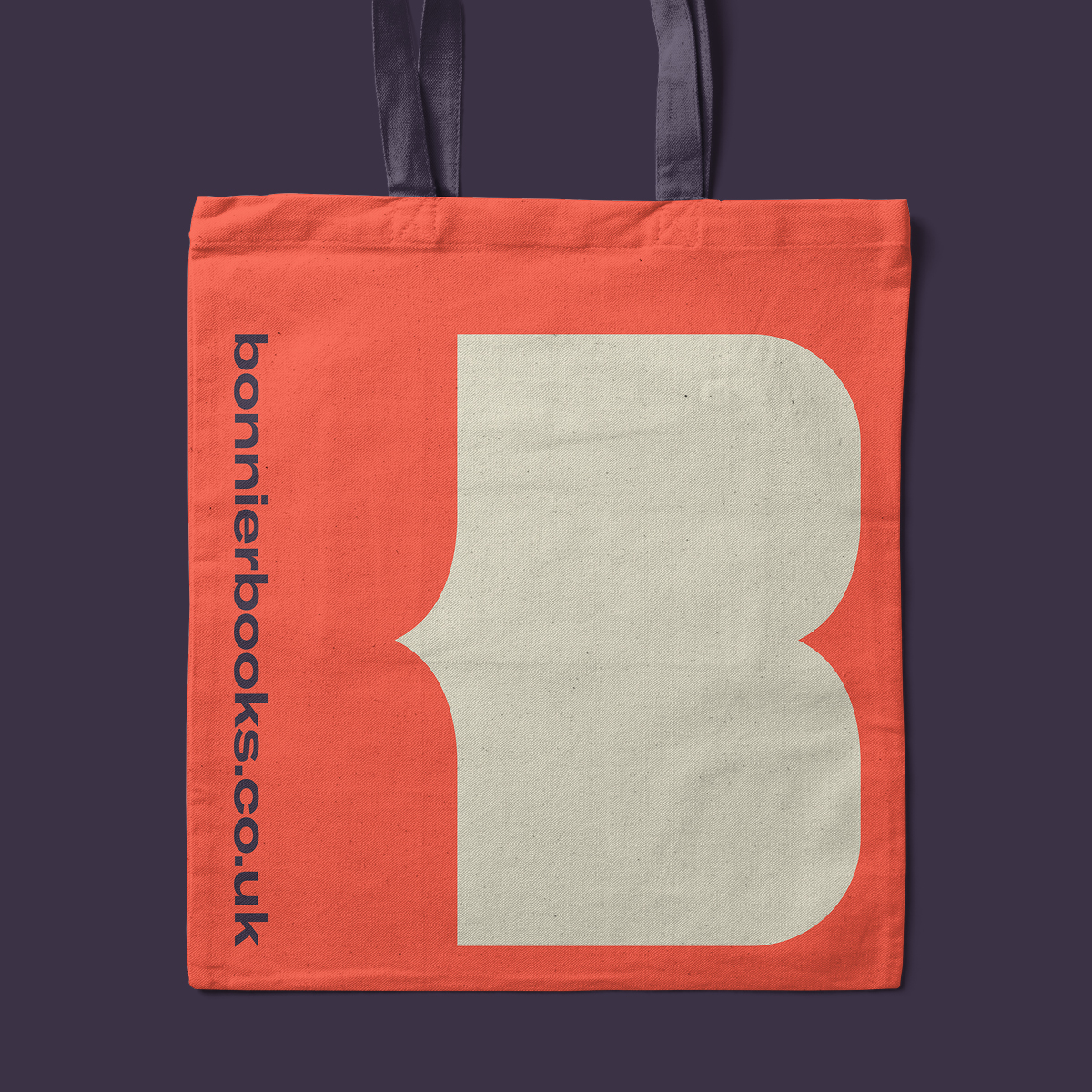
Our idea was built around the key principle of being ‘open’ – from this we created The Open Book brand symbol, derived from the ‘B’ of the Bonnier wordmark. It’s simple, modern and can be applied creatively as a visual device in a variety of ways.
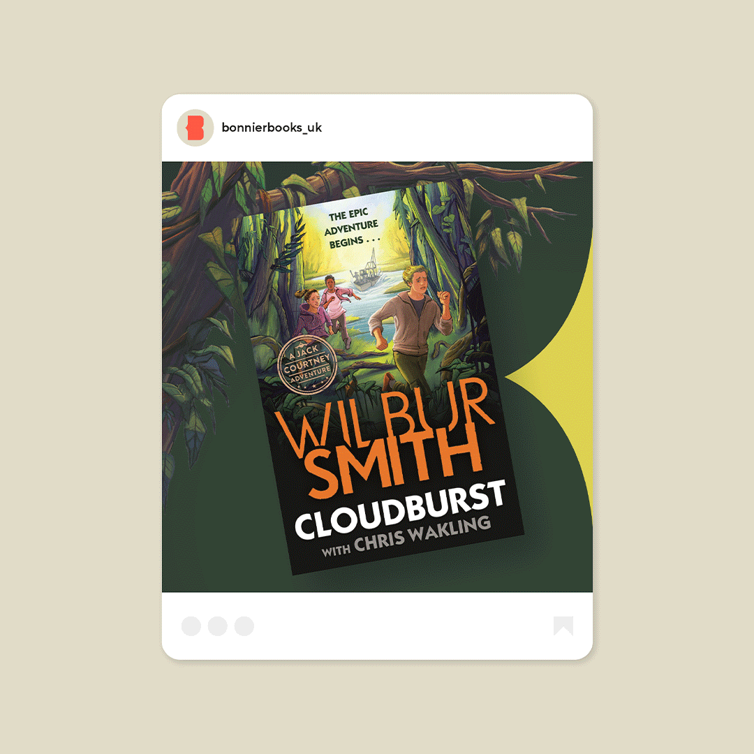
The ‘B’ symbol can be used as a platform to deliver messaging, hold quotes, photography, integrate with illustration or promote the books themselves. It can also draw colour and style from the content it’s representing to become part of each and every story. The ‘B’, is a creative and inclusive symbol, it’s flexible, adaptive and workable – it can be used extended to hold content in wider formats and can work in all kinds of different media including social and extreme banner formats.
The Open Book ‘B’ symbol is further brought to life in animation with a paper texture, audio track and page turning sound effects.
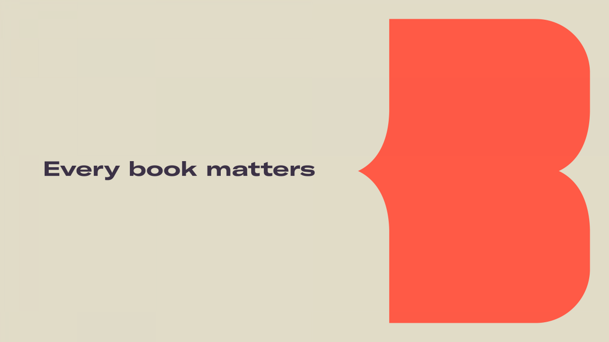
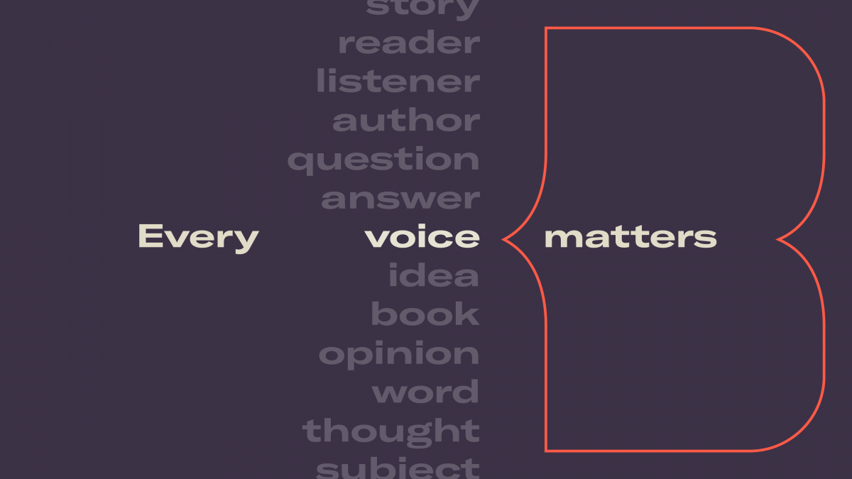
The existing BBUK wordmark has been retained, along with the strapline ‘Every book matters’ which has been brought to life across communications and used to interact with the new ‘B’ symbol – as if it were being spoken by it – a reflection of the brilliant voices they work with.
A new typeface combination includes a confident, wide format, headline typeface and a modernised, easy to read, body copy typeface – and a more vibrant and sophisticated colour palette that reflects the creativity of BBUK’s publishing teams and their wider publishing community.
All these new and existing elements work seamlessly together, resulting in a contemporary brand identity that not only has links to its literary heritage but most importantly, a look to the future.
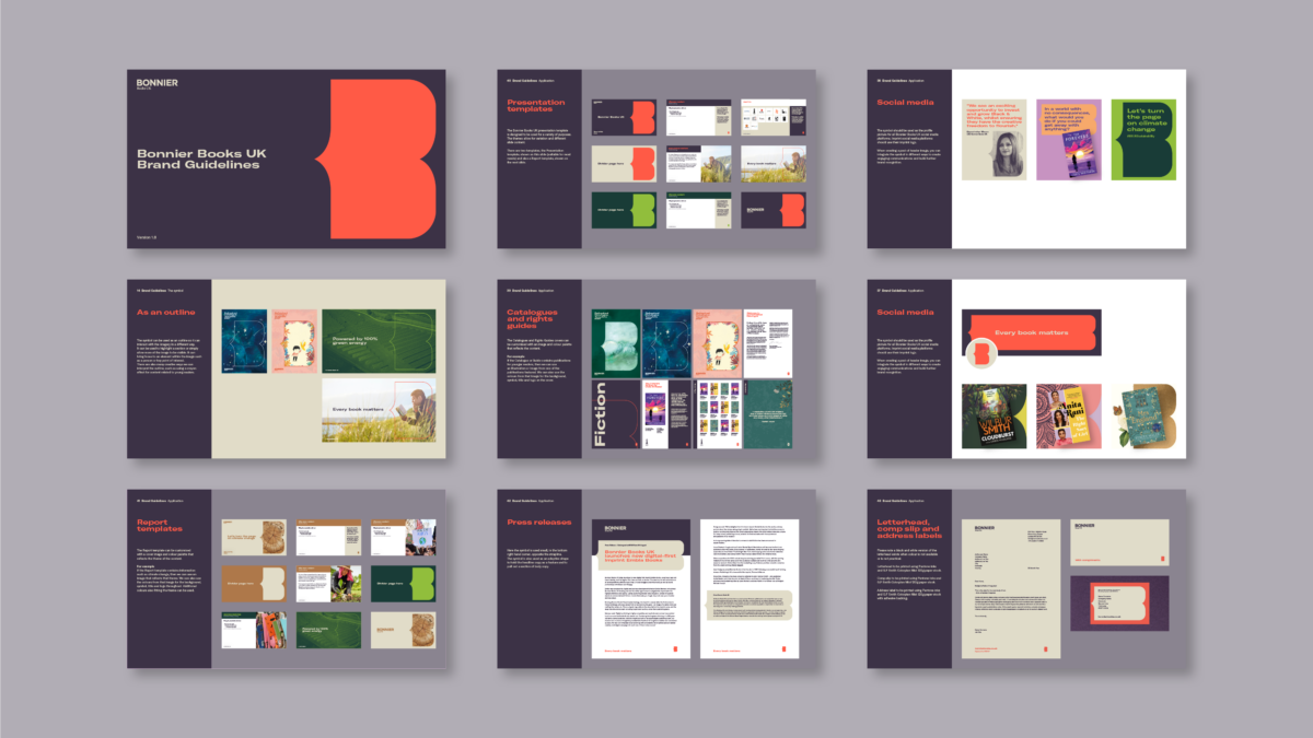
The new brand is applied creatively to a variety of applications for a more cohesive and inclusive feel across the website, social media, pitch and sales presentations and stationery (sustainably printed by our B Corp certified print partner on FSC coloured papers to match the new brand palette). Other applications include catalogues, rights guides, press releases, report templates and co-branding. A comprehensive set of guidelines have been created to ensure the brand can be easily interpreted by teams across the business.
Perminder Mann, CEO, commented: “As we approach the next phase of our growth, it became clear that we needed a more dynamic brand identity that better communicates our values as a modern, sustainable publishing business for the future. I’m thrilled to be sharing our new look with our authors, illustrators, brand partners and the wider publishing community. I hope they love it as much as we do.”
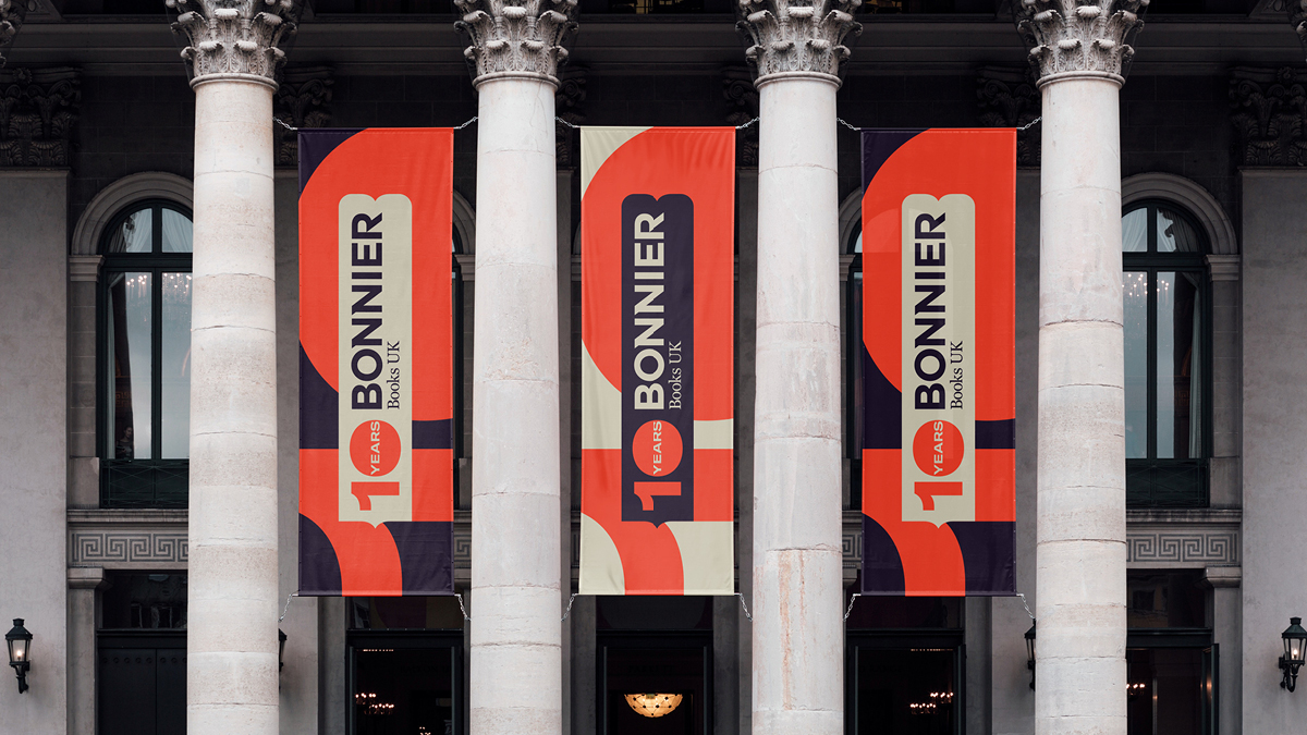
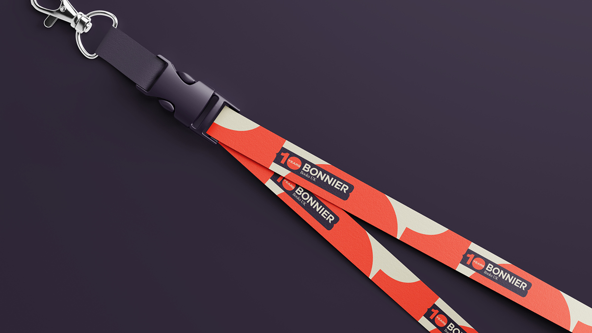
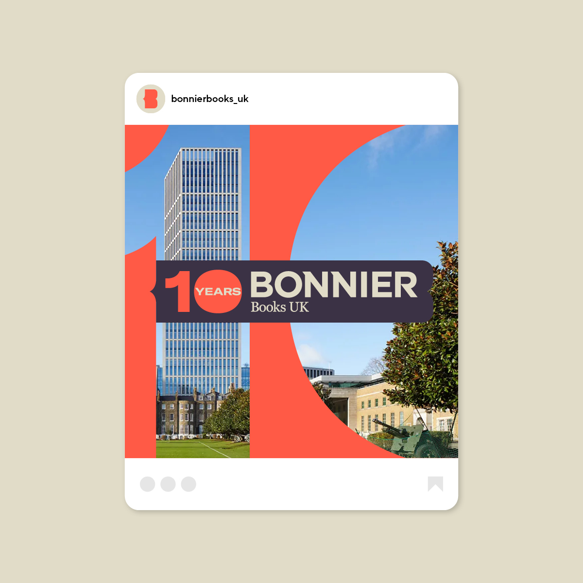
To mark their milestone anniversary in 2025, we created a celebratory 10 Year Anniversary brand, for use across trade fairs such as London Book Fair, invites, web and social.
Awards
The Shark Awards – International Design
Brand Identity – Bronze
In the press
Design Week – Rebrand ↗
The Bookseller – Rebrand ↗
The Bookseller – 10 Year Anniversary ↗