

SOPRO
A brand refresh for Sopro, an outreach service who help businesses grow and discover new markets by delivering a reliable flow of ideal sales leads.
Sopro wanted to evolve the look and feel of their brand, and create new tools that could be used easily and effectively to strengthen and support their existing brand identity and website.
The existing logo, symbol and typeface would stay the same, so the challenge was to explore a new idea to build from and at the same time, a new way to use the existing elements to bring the brand to life – ensuring both the existing and new brand components work seamlessly together.
We began with a strategic workshop to dive into the Sopro world and redefine the purpose, vision, mission and values for the business. This gave us the insights and firepower we needed to progress into the concepts stage.
It was clear we needed to create a playful and unified identity so the teams in different locations have the tools they need to create a variety of content that excites, is on brand and is always globally consistent.
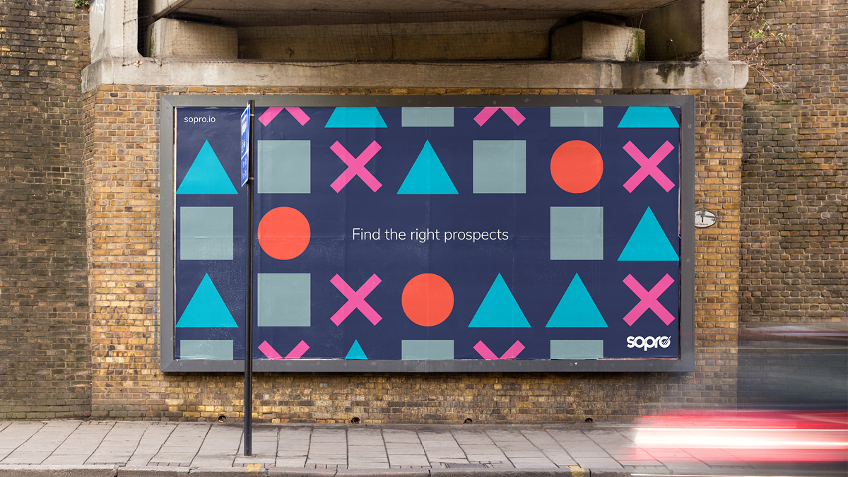
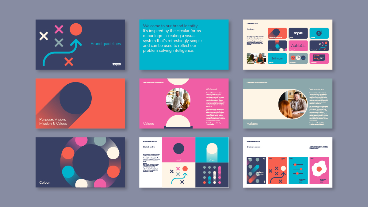
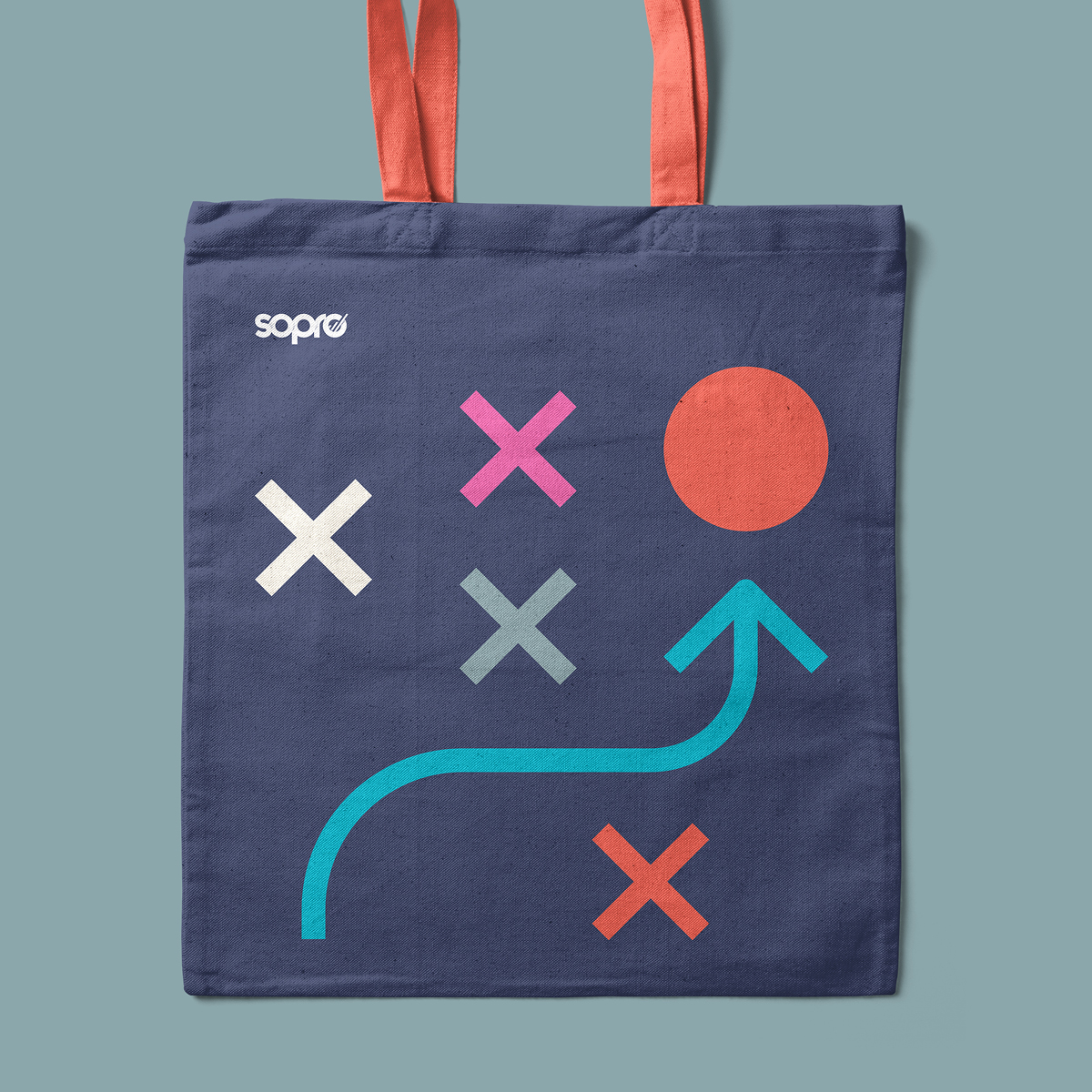
We took inspiration from the circular forms found within the existing logo and symbol to create a visual system that’s refreshingly simple and can be used to reflect Sopro’s problem solving intelligence and to support messaging.
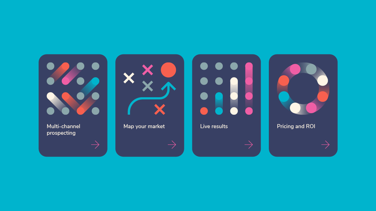
Using circles as the central and consistent hero element, we created an energetic brand, using a combination of static and active elements.
The circle can be used to represent ideal prospects, with other graphic shapes featuring to support these messages, such as: squares, crosses and triangles, that depict incorrect or lower quality prospects or noise – arrows are used to find the right path through, to discover, identify and target the ideal prospects.
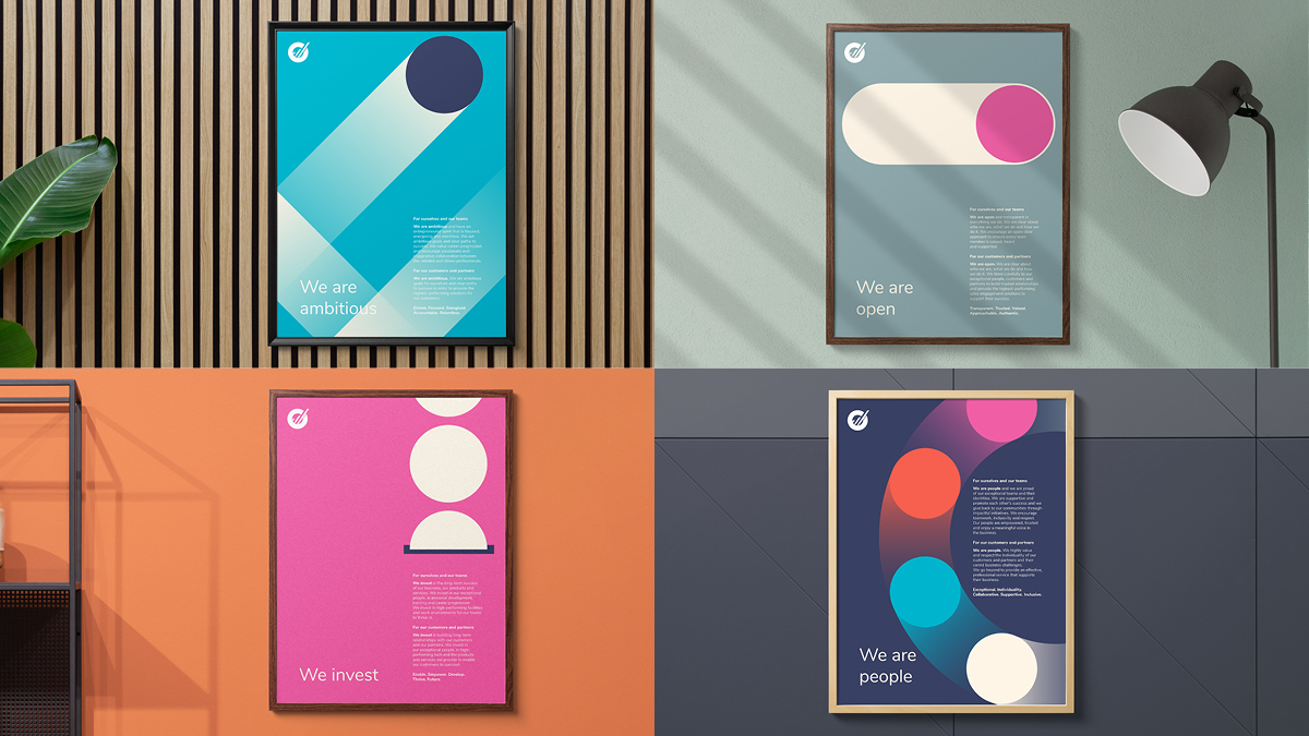
The bold and bright Values posters feature playful depictions of each message, such as: ‘We are ambitious’ where the circle pings around the edges of the poster and launches off, circular coins dropping into a slot for ‘We invest’ and a circular unlocking slider of a device for ‘We are open’.
Motion design adds even more energy and excitement. An expressive and distinct animated graphic toolkit showcases the dynamism of the brand, depicting products and services such as: ‘Gifting’, ‘Lead Generation Machine’, ‘Letters’ and ‘Emails’, and visual concepts such as: ‘connection’ and ‘integration’. Different colour gradients add extra movement with translucency that combines well with the coloured backgrounds. The circular form remains the constant element throughout.
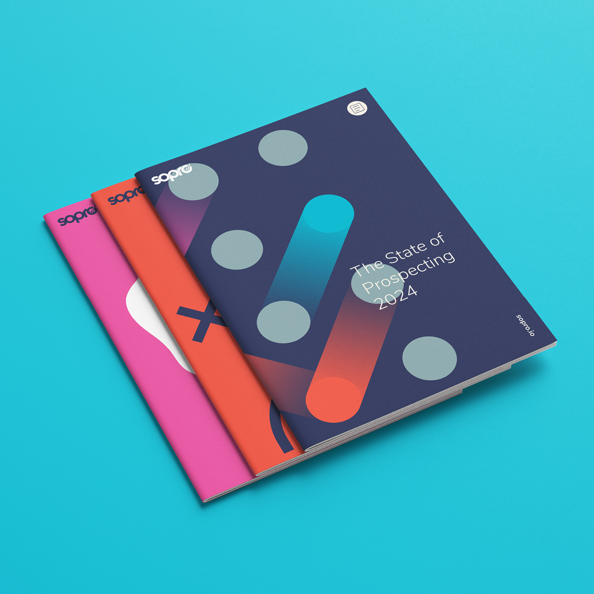
We simplified and optimised the existing colour palette – removing some darker tones and featuring new bright tones of Pink and Turquoise to complement the Coral and Diesel. The new palette uses refreshing combinations to add vibrancy, overall balance and to highlight UI features, such as buttons and promotional banners. The colourful system also acts as a platform for featuring cut-out imagery of people, with a wide variety of backdrop options to bring flexibility and freshness on web and social, while maintaining consistency.
The graphic system is designed to be adaptable, featuring abstract to descriptive imagery to give a technological and creative feel that’s also practical – lending itself well to data visualisation and combining naturally with photography of Sopro’s teams, removing the need for generic stock imagery.
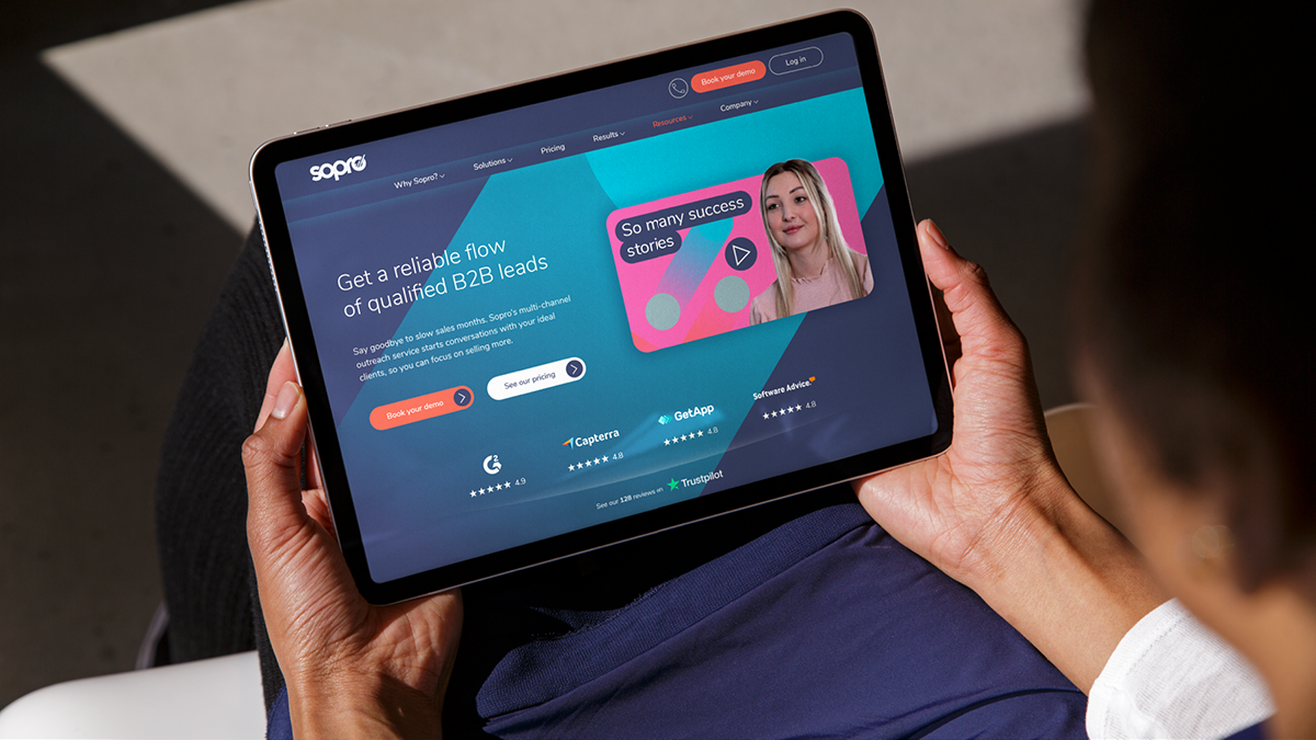
We designed and consulted on key pages of the Sopro website, including a homepage that features a scrolling triggered animated journey, following the Sopro Coral circle, through their offering, with the circle becoming part of each section of the webpage as you scroll down it. New iconography helps to signpost and identify key information quickly and clearly.
The new concept explored an enhanced brand toolkit with new design assets, a refined colour palette, photography featuring Sopro’s people, new applications and brand guidelines. The solution means a greater level of freedom and inspiration for the brand and the people who use and interact with it. The Sopro teams can create communications that are engaging, consistent and have flexibility, variety and energy.