


SIMON & SCHUSTER
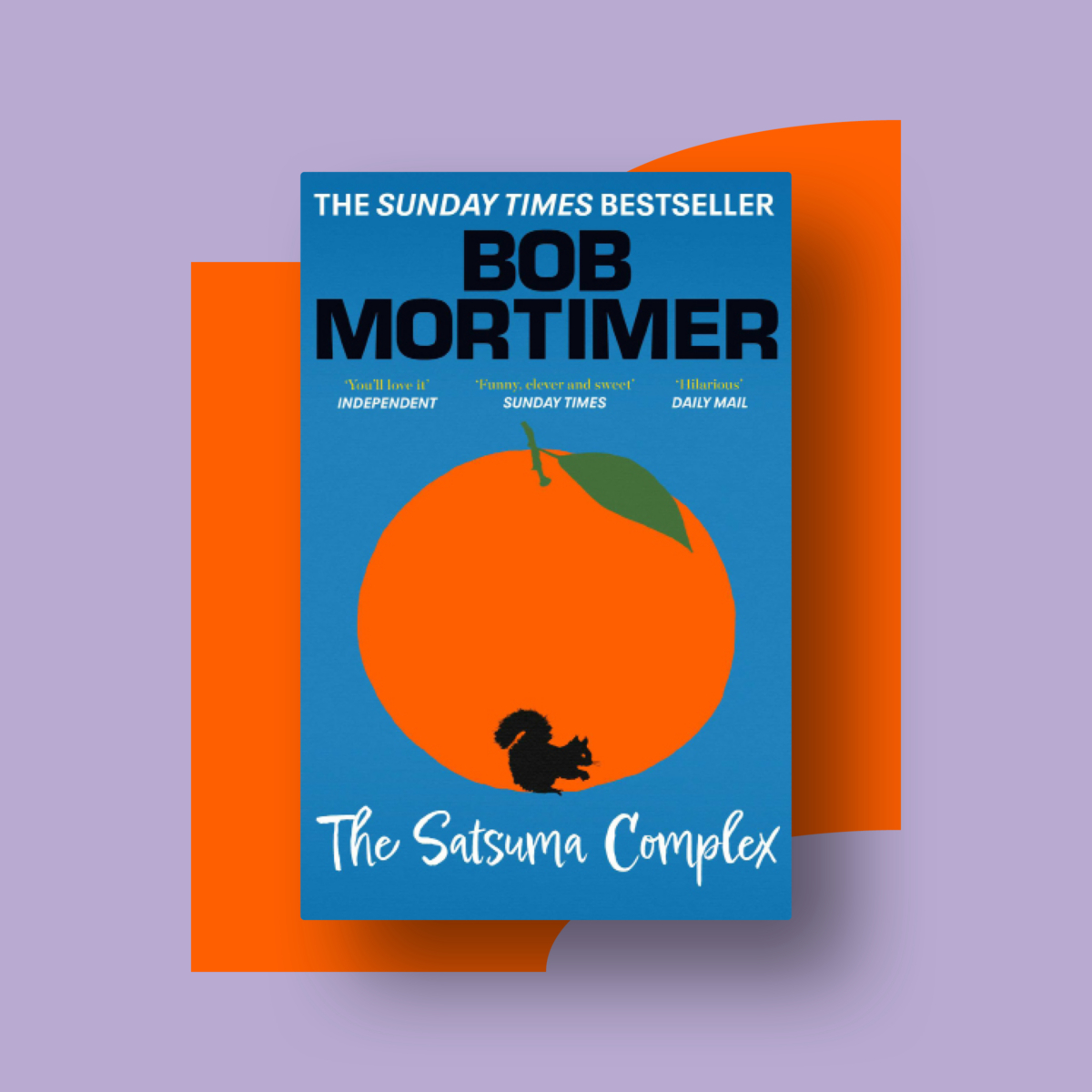
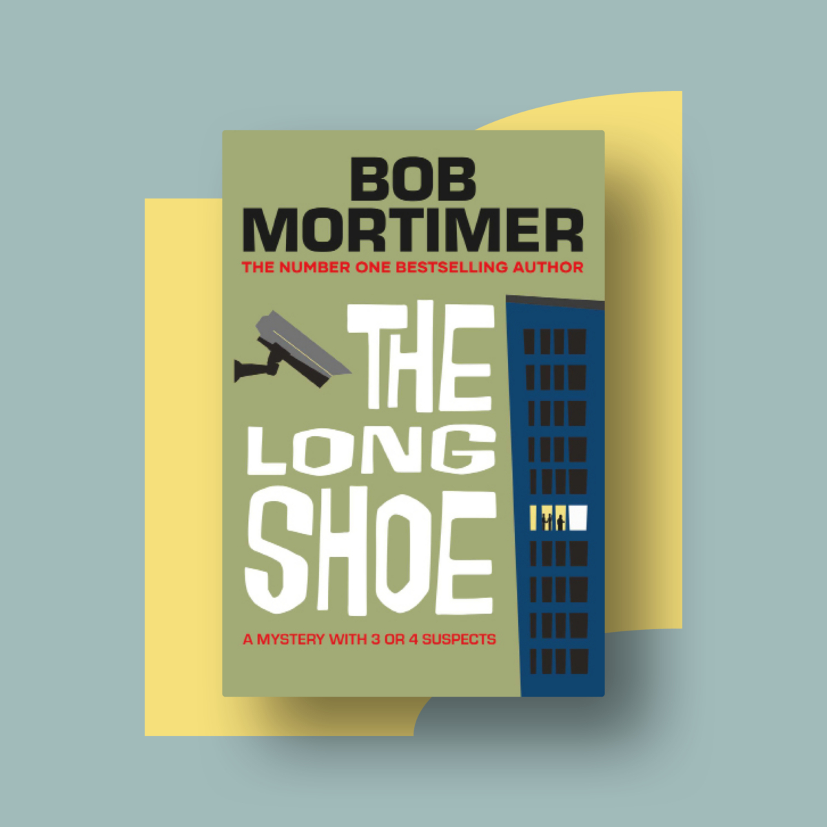
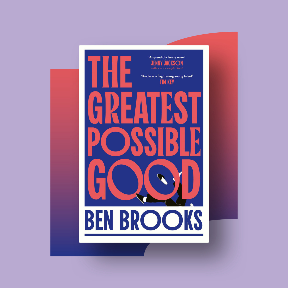
We had the pleasure of being invited by new CEO, Perminder Mann, to deliver a corporate rebrand for leading book publisher Simon & Schuster UK and International – a division of the prestigious publisher, Simon & Schuster. Home to authors Philippa Gregory, Colleen Hoover, Rupi Kaur, Adam Silvera, Kamala Harris, Bob Mortimer and Ben Miller, to name just a few.
SCOPE
Simon & Schuster UK and International needed a brand update. A new identity that would build on the heritage and strength of their parent company Simon & Schuster, while creating something that was bespoke to the division and truly represented who they are and where they’re headed. A fresh, new look, signalling positive change within the company and practically providing the tools and assets that would empower the business to move forward in a creative, consistent and powerful way.
The project required a new concept, assets, communications, and a comprehensive set of brand guidelines that could be creatively and confidently used across the business to showcase the brand consistently and represent the future of Simon & Schuster UK and International.
The initial scope saw the generation of three concepts. One close to home, one a complete departure, and one something a little in between. During the process, the opportunity to retain a nod to the heritage and familiarity of the parent brand (which goes back to the company’s creation in 1924) while creating a modern interpretation, felt like the perfect way forward.
THE FRAME
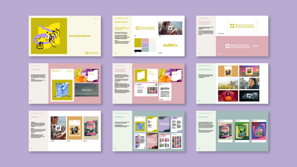
Our idea in the recommended concept was built around the frame that originally bordered ‘The Sower’ of the parent brand and still does today, but using it in a fresh way – to frame and celebrate the publisher’s content and the exciting titles they publish.
We built on the frame to develop the idea into the final brand symbol – a frame with an opened book within it. Representing the heart of the brand and turning the page towards the future.
With this symbol, we created a graphic device that can adapt and be used flexibly to add breadth and variety across all applications. The ‘frame’ itself being used to house and showcase content, and the inner book providing additional flexibility, creating an additional shape that can be used as a subtle watermark, or a strong secondary symbol, to bolster brand awareness while keeping communications fresh. The inner book can be sized to hold variable content while the master ‘frame’ symbol remains strong and unaltered.
WORDMARK & TYPE
Alongside the fresh new symbol, the full company name is used in the wordmark to provide clarity in terms of the division itself, and recognition of the strength of the Simon & Schuster name. The symbol can be used alone or locked up with the full wordmark, with variations created for local brands. The clean-cut geometry of the symbol means it can be easily reproduced at any size and also made into physical applications such as signage, awards, furniture or even a trade stand for example – with the brand having lots of opportunities for interior office and trade integration.
The typeface, Effra, has a distinct and modern ampersand, which works well in the wordmark and as titles and headlines. It’s clear and easy to read, just like a book should be.
IMAGERY & COLOUR
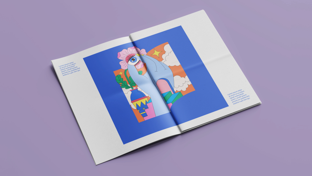
The brand can be combined with photography, art, or illustration, by placing imagery inside, through or on top of the frame to create a visually interesting and immersive feel while prominently featuring the brand.
We wanted a bold and unique colour, something that would stand apart from other brand colours commonly seen in the industry. We paired Chartreuse with Deep Black and White to create a fresh and clean Primary palette, with an Extended palette complimenting in pastels of Pale Pink, Violet and Grey Green. Four tertiary colours in Light Yellow, Cool Grey, Warm Grey and Light Green add further flexibility. Colour can also be content-led, and easily drawn from book cover artwork, illustration or photography.
SUMMED UP
The overall result is a contemporary corporate brand identity that represents who Simon & Schuster UK and International are today and the future they are working towards, while retaining links to the brand’s literary heritage.
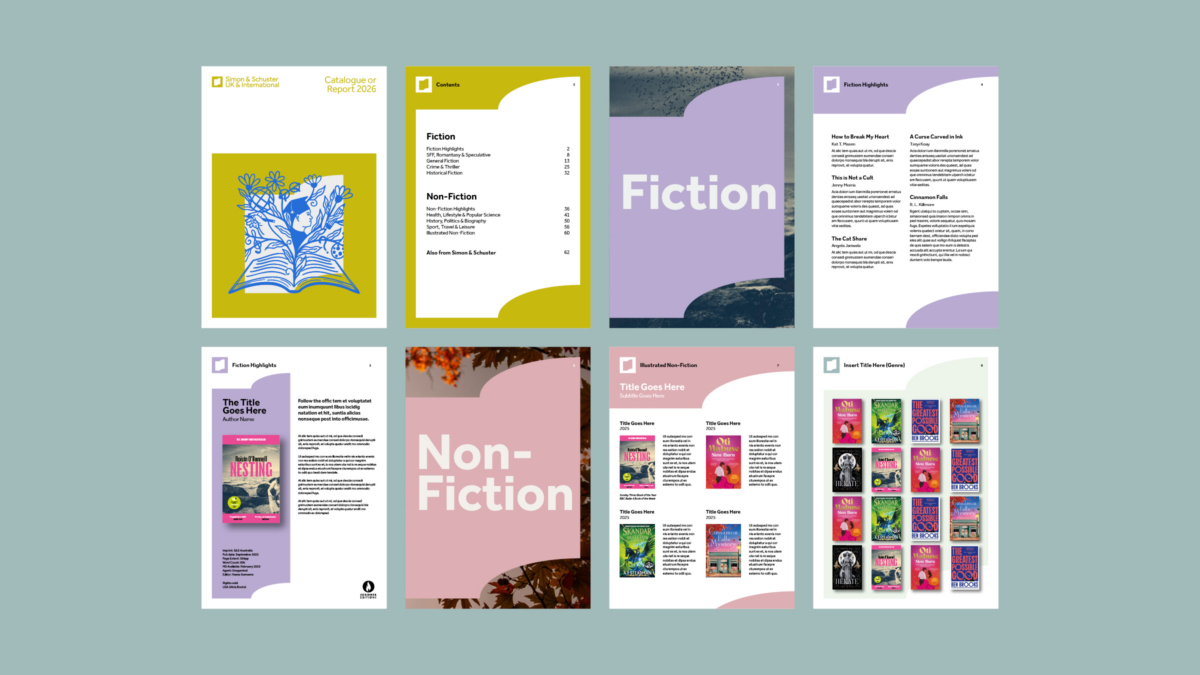
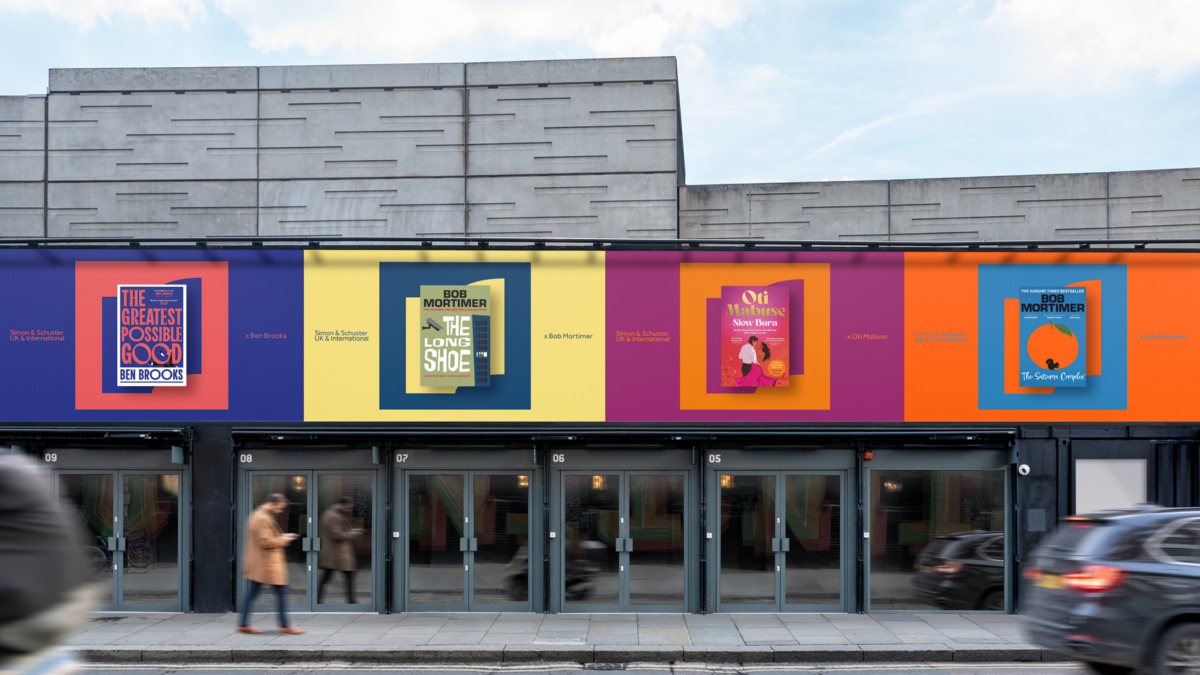
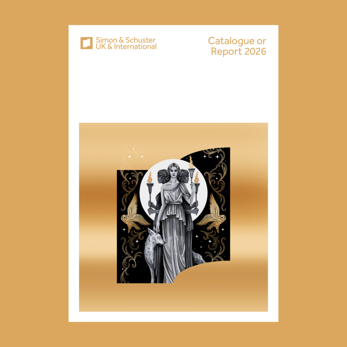
The new look and feel is applied creatively to a variety of applications for a cohesive and inclusive feel across presentations and pitches, social media, press releases, catalogues, reports and stationery – many of which feature photography and illustration to give a creative feel that’s also practical and removes the need for generic stock imagery. The comprehensive set of guidelines created ensure that the brand can be easily interpreted by teams across the business, establishing tools and assets that employees can be proud of.