


Bonnier Books UK
Four years on from our original rebrand ↗, we revisited and refreshed the brand identity for Bonnier Books UK, the 6th largest trade book publisher in the UK.
To build on the momentum created since the launch of the ‘Open Book’ B symbol and to stay future focused, it has been the right time to explore evolution opportunities within the brand identity – to greater align with where BBUK are now and where they’re heading.
We began the project with a scoping and inspiration exercise to define what areas of the brand identity to push, refine and elevate. Identifying a direction, we began exploring these areas in detail.
We explored colour, drawing inspiration from BBUK’s Scandinavian roots, culture and their belief in publishing a diverse range of people, for a diverse range of readers and listeners. This resulted in the creation of a new fresh, vibrant, yet calm and inviting set of tones and the simplification of the primary palette.
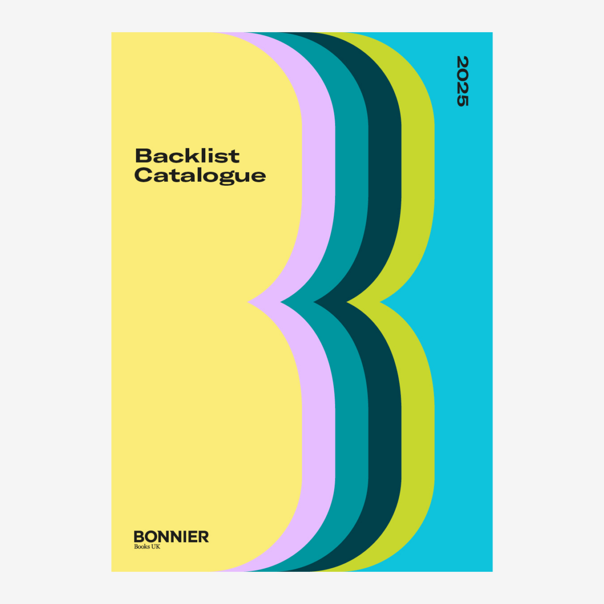
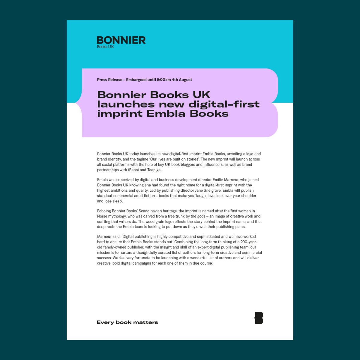
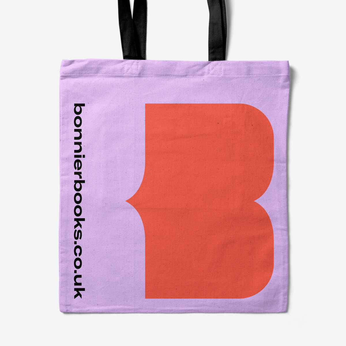
Black and White now feature predominantly, alongside the brand Orange. The new brighter, contemporary secondary palette brings even more joy and flexibility. It features Violet and Yellow, and natural tones of Green, Teal and Blue – supported by a rich, dark Ink and a light Warm Grey. All of which complement the new paired back primary palette and create refreshing, adaptable combinations.
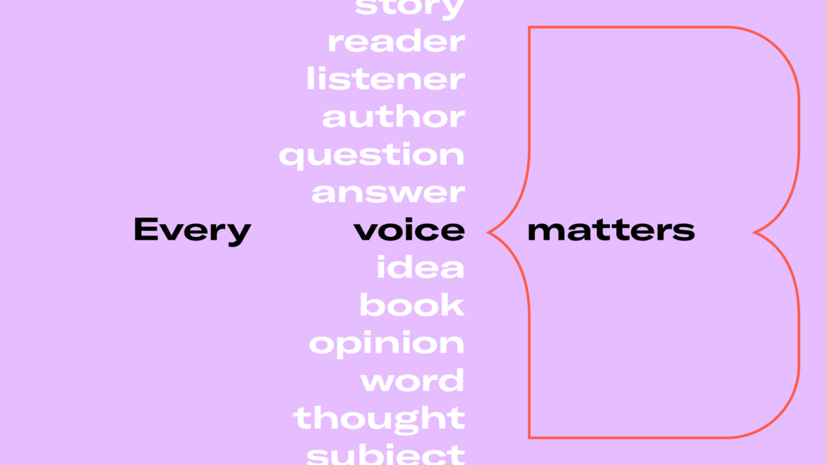
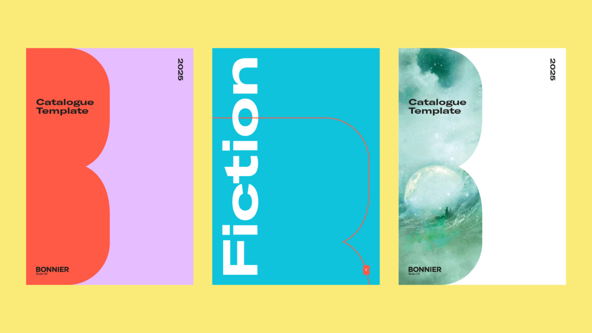
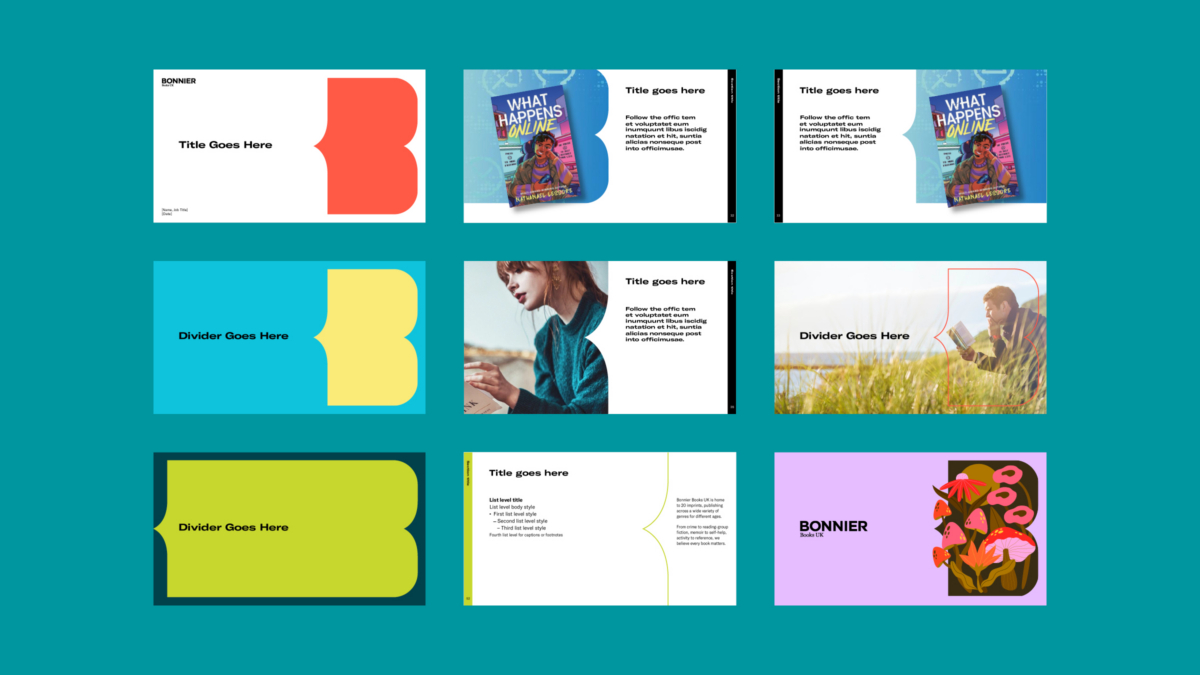
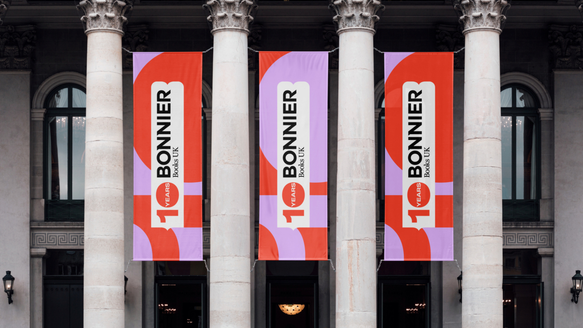
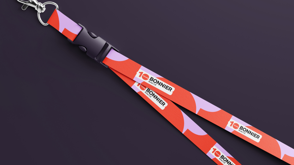
We pushed and refined the overall style of the brand and how it’s designed into applications – with a bolder use of colour, typography and layout. Using more white space with pops of colour creates a fresh, cleaner feel, with new uses of the B symbol creating further flexibility. These, among other design decisions help push the creativity, expression and personality of the brand, bringing it to life in new ways.
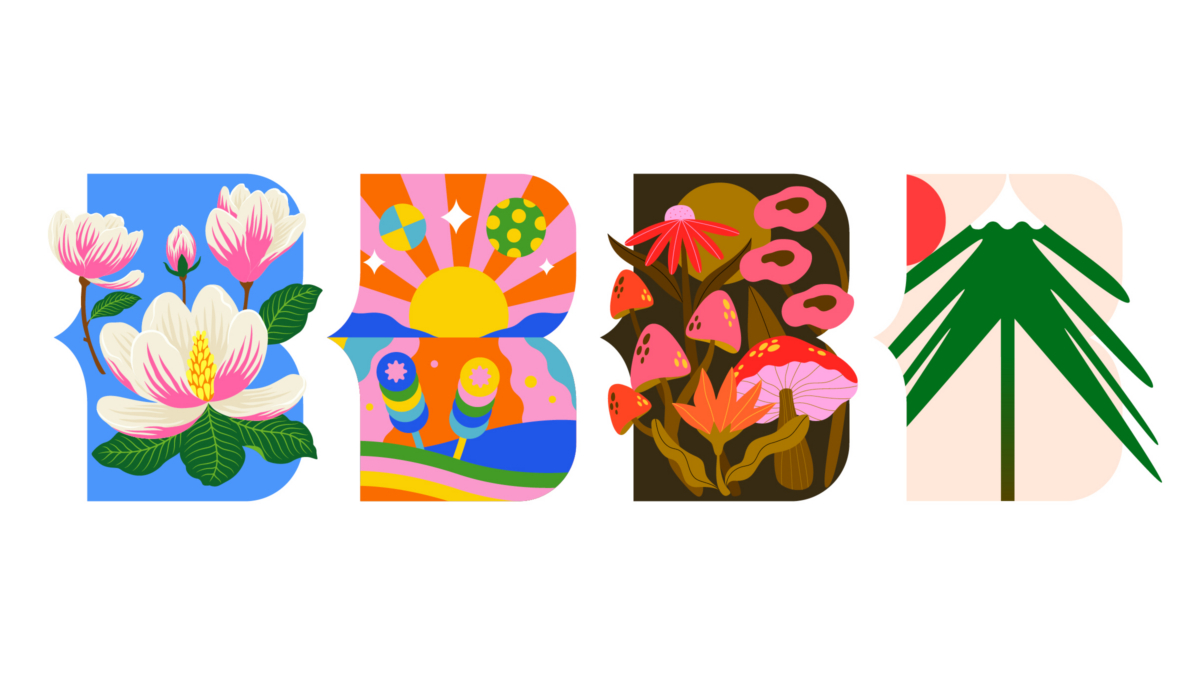
We elevated the use of the ‘Open Book’ B symbol further, using photography to create more immersive imagery and illustration that combines, interacts and emerges from the symbol. A new library of B symbols were designed to represent seasonal themes and BBUK’s values, and their culture rooted in the warmth of a family-owned business, guided by Scandinavian values. The new B’s bring a variety of stories to the toolkit, giving teams the assets they need to draw on when they need them.
The bolder, cleaner, refreshed brand identity has been developed to elevate the BBUK brand for the next phase of their journey, while retaining recognisability and flexibility. The evolved brand aims to empower, inspire and continue to stand out.
The new and existing brand elements combine to bring a boost of creativity and energy, and further demonstrate the adaptability of the ‘Open Book’ B symbol, the wider brand identity and importantly, how the brand continues to grow with BBUK .
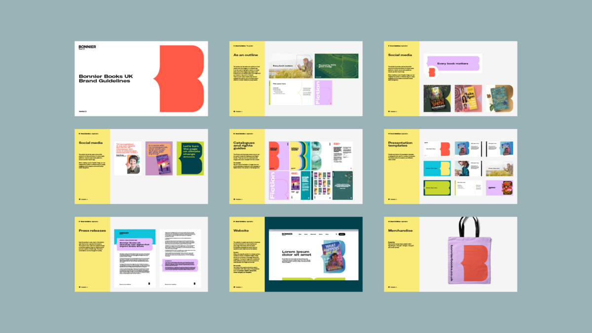
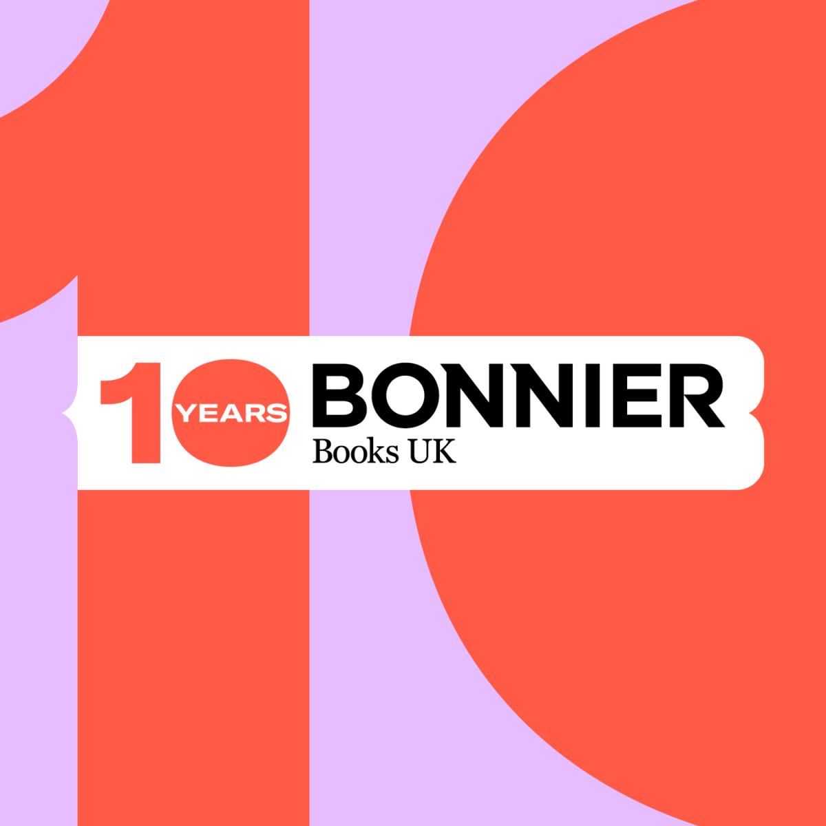
The evolved brand identity is applied creatively to a variety of applications for a cohesive and inclusive feel across the website, social, pitch and sales presentations and stationery. Other applications include catalogues, rights guides, press releases, report templates, internal comms, co-branding and the 10 year anniversary toolkit. A comprehensive set of guidelines have been updated to ensure the evolved brand can be easily interpreted by teams creatively and consistently across the business.